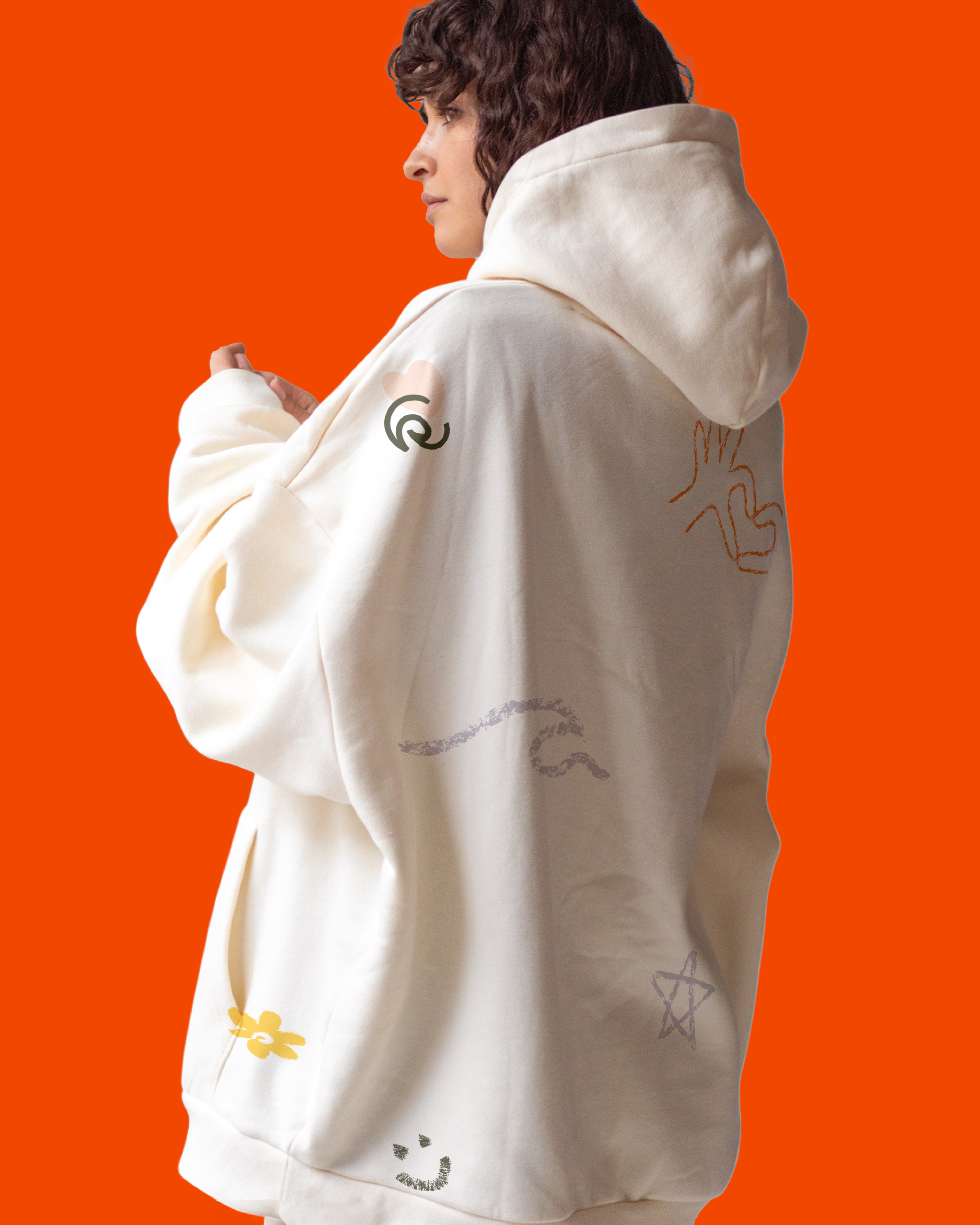
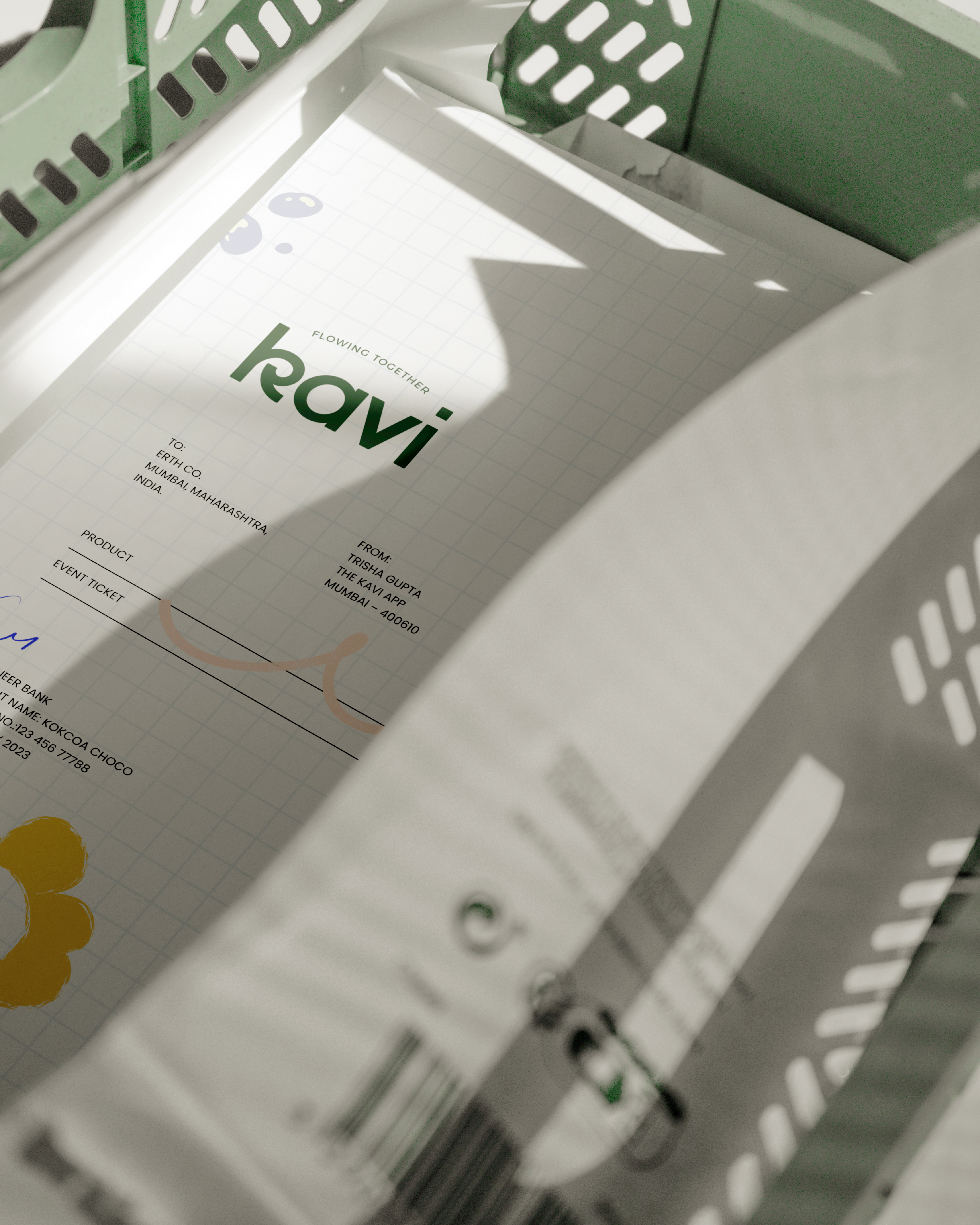
We collaborated with Kavi to develop a young and friendly brand identity for their online community platform, designed for women.
Client
Year
Location
Scope of Work
Kavi
2024
Mumbai
Branding Identity and Illustration
Erth Co, a graphic design studio in India, worked with Kavi to develop a young, friendly brand identity and illustration system for their women-led community platform.
Kavi is an online community platform designed specifically for women. It aims to provide a safe and supportive space where women can express themselves through poetry, share their experiences, and connect with others. The platform's mission is to empower women and allow them to flourish through every stage of life.
Problem Statement:
Kavi sought a brand identity that would resonate with a diverse community of women and create a safe, supportive online space. The challenge was to develop a brand that reflected the fluidity, adaptability, and strength of women while also fostering a sense of community and belonging.
Design Strategy:
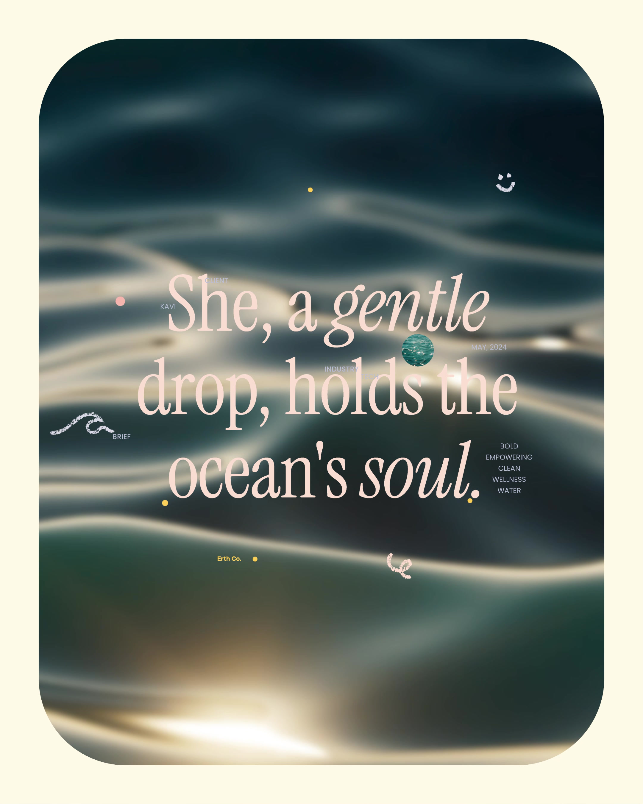
Our approach was to draw inspiration from the natural element of water, which embodies many of the qualities we associate with women. By leveraging the metaphor of water, we aimed to create a visually appealing and emotionally resonant brand that would connect with Kavi's target audience.
Design Focus:
-
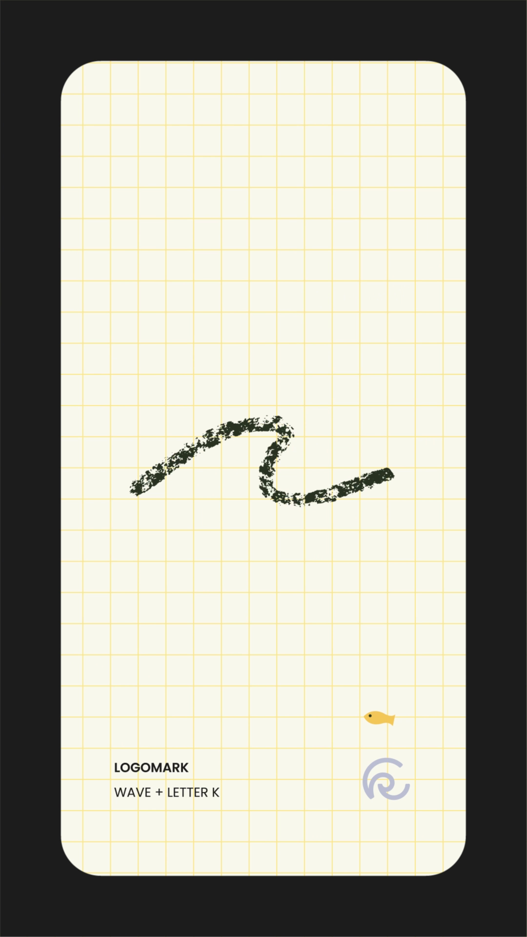
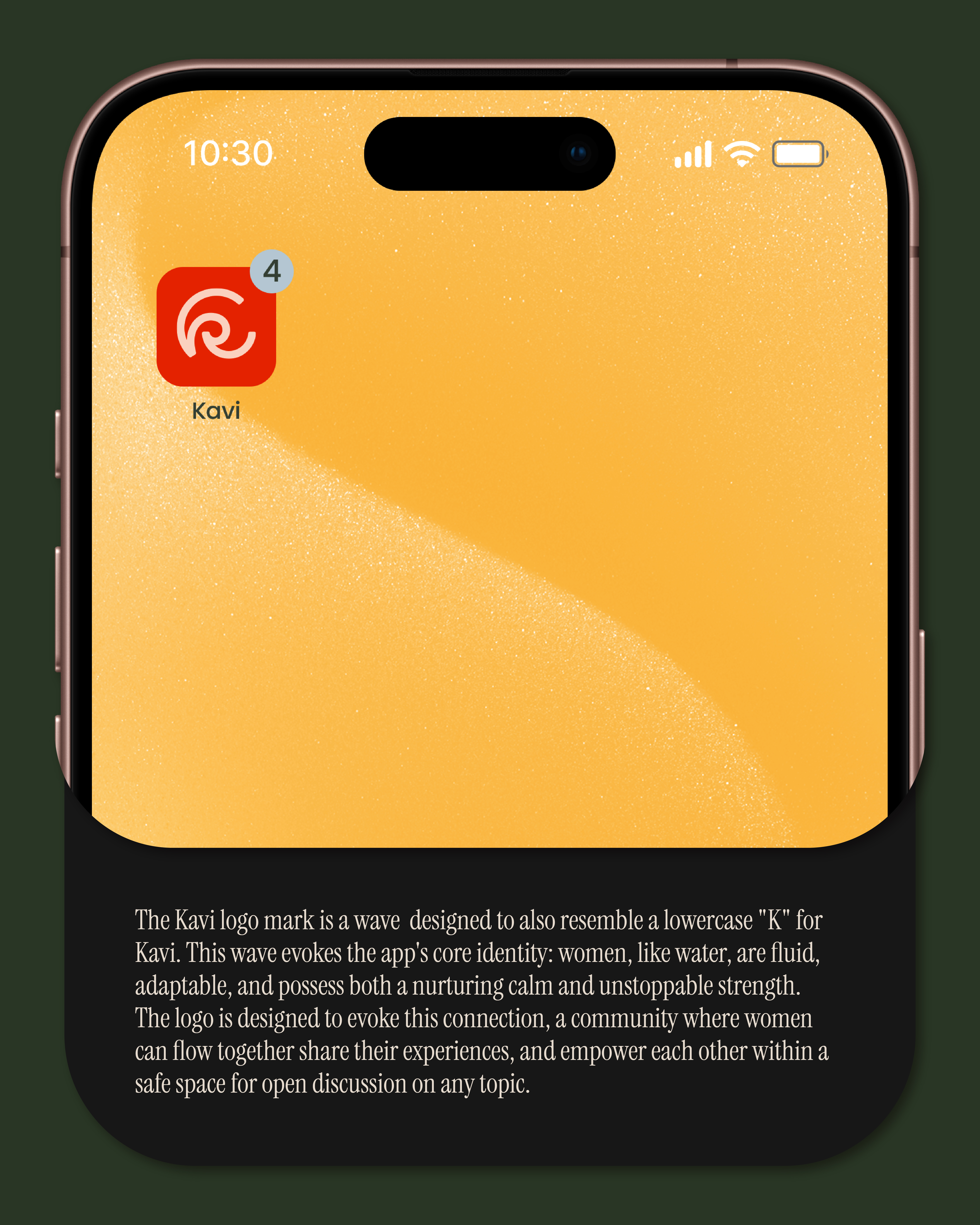
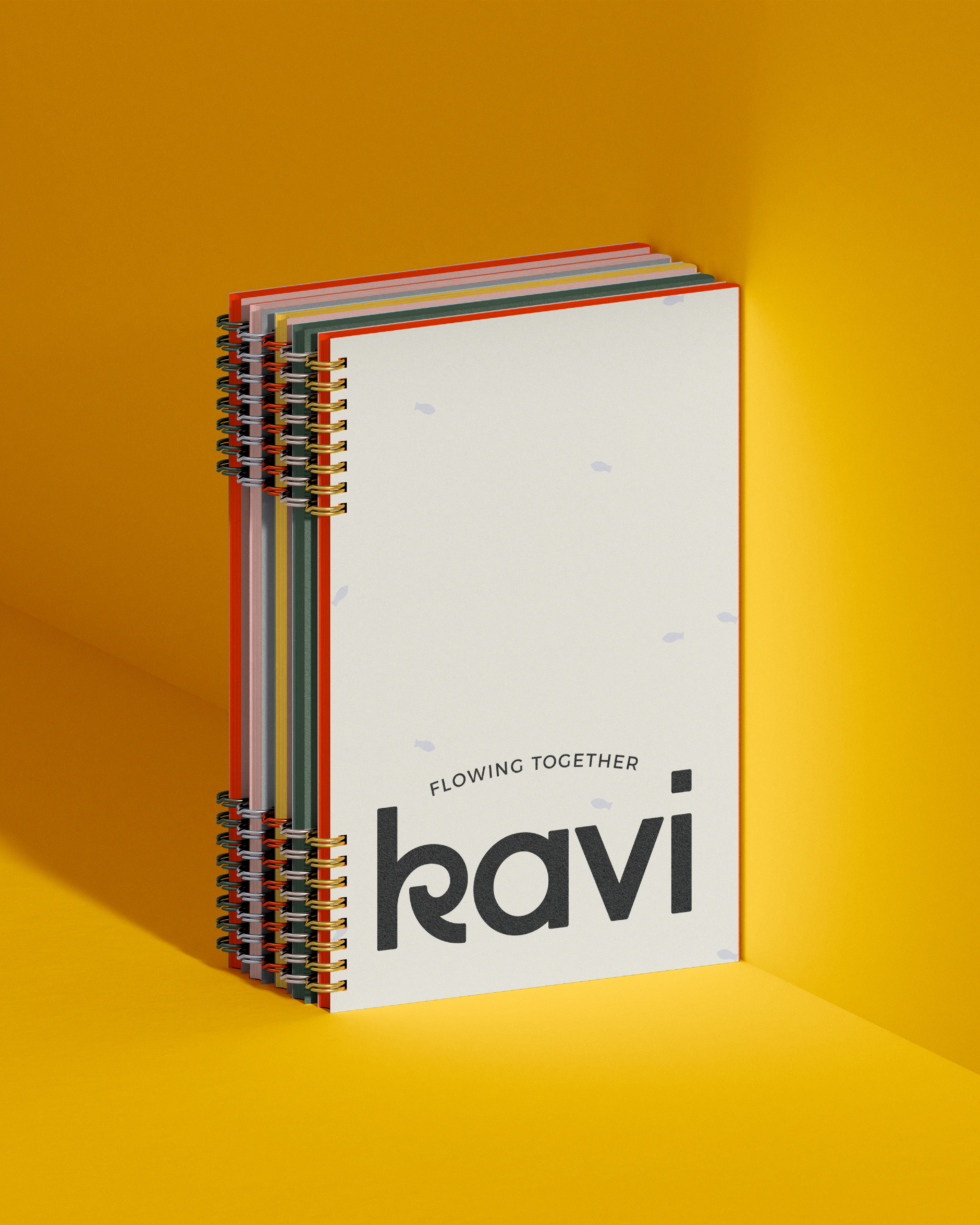
Water-Inspired Logo: The Kavi logo, a stylized wave, symbolizes the fluidity, adaptability, and strength of women. It also serves as a visual representation of the community, where women can flow together and share their experiences.
-
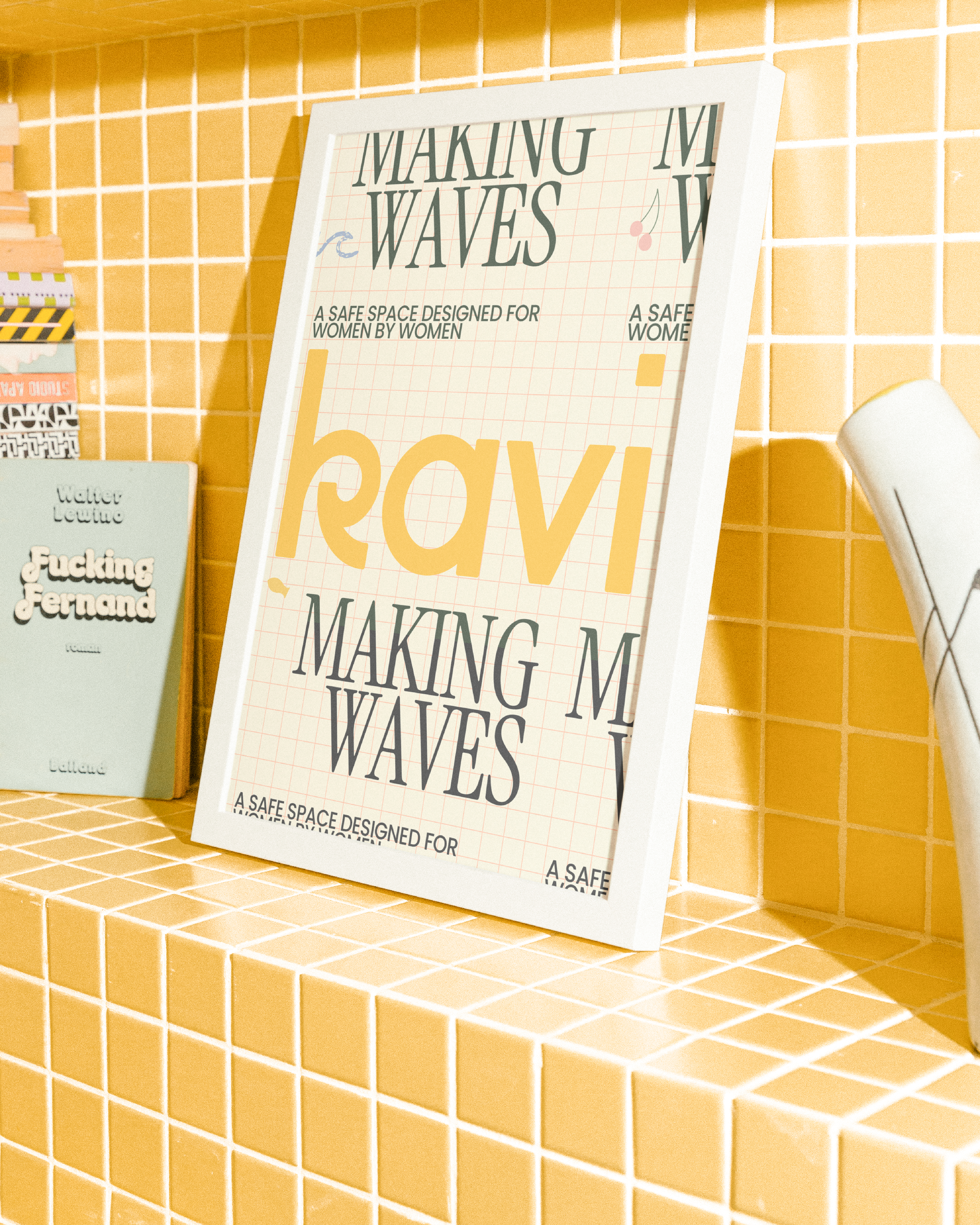
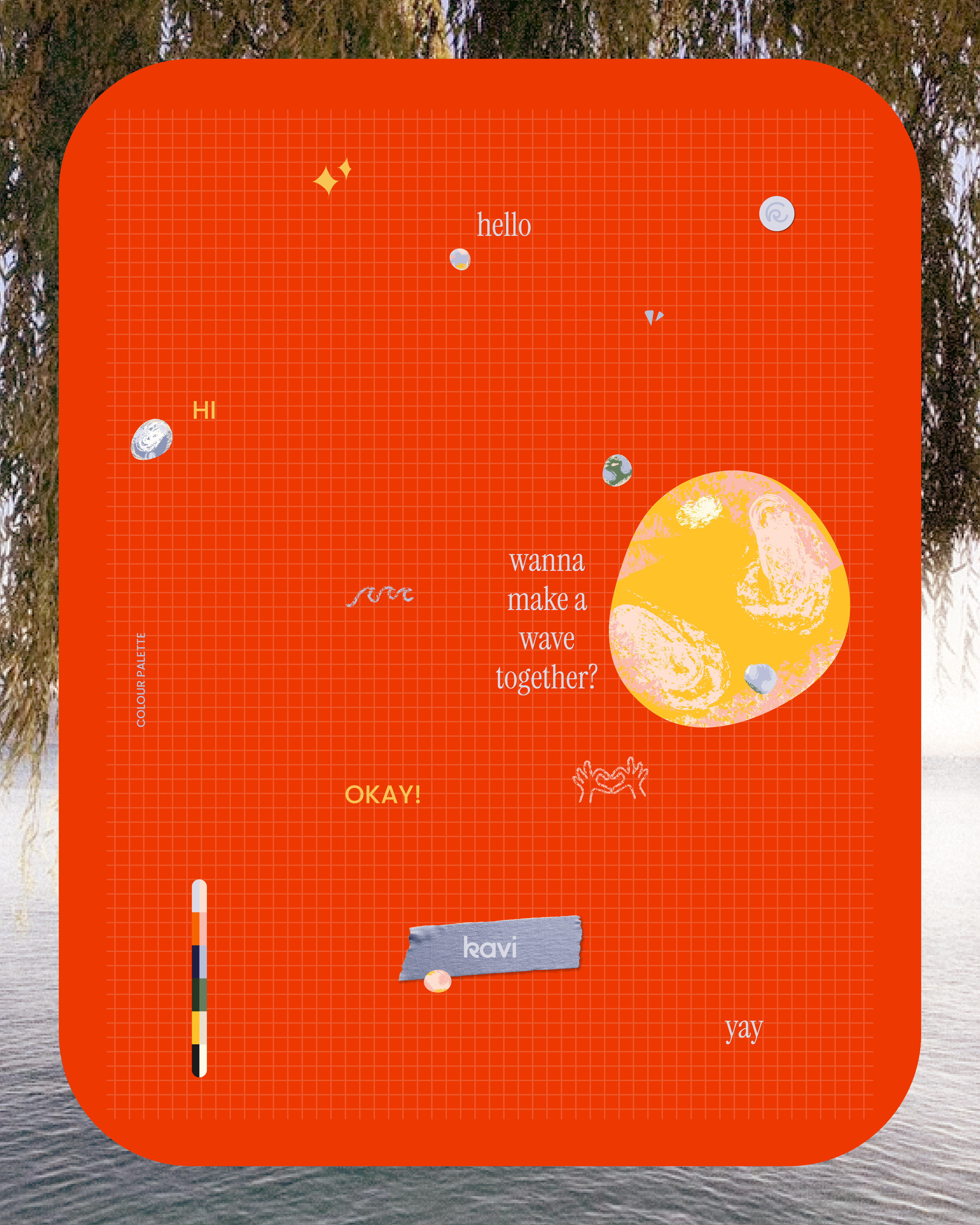
Diary-Inspired Aesthetic: To create a sense of intimacy and informality, we adopted a diary-like aesthetic with grids, handwritten typefaces, and a soothing colour palette. This design approach reflects the personal nature of the content shared on the app and reinforces the idea of a safe, private space.
-
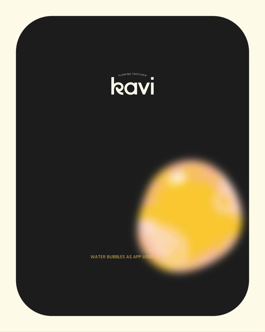
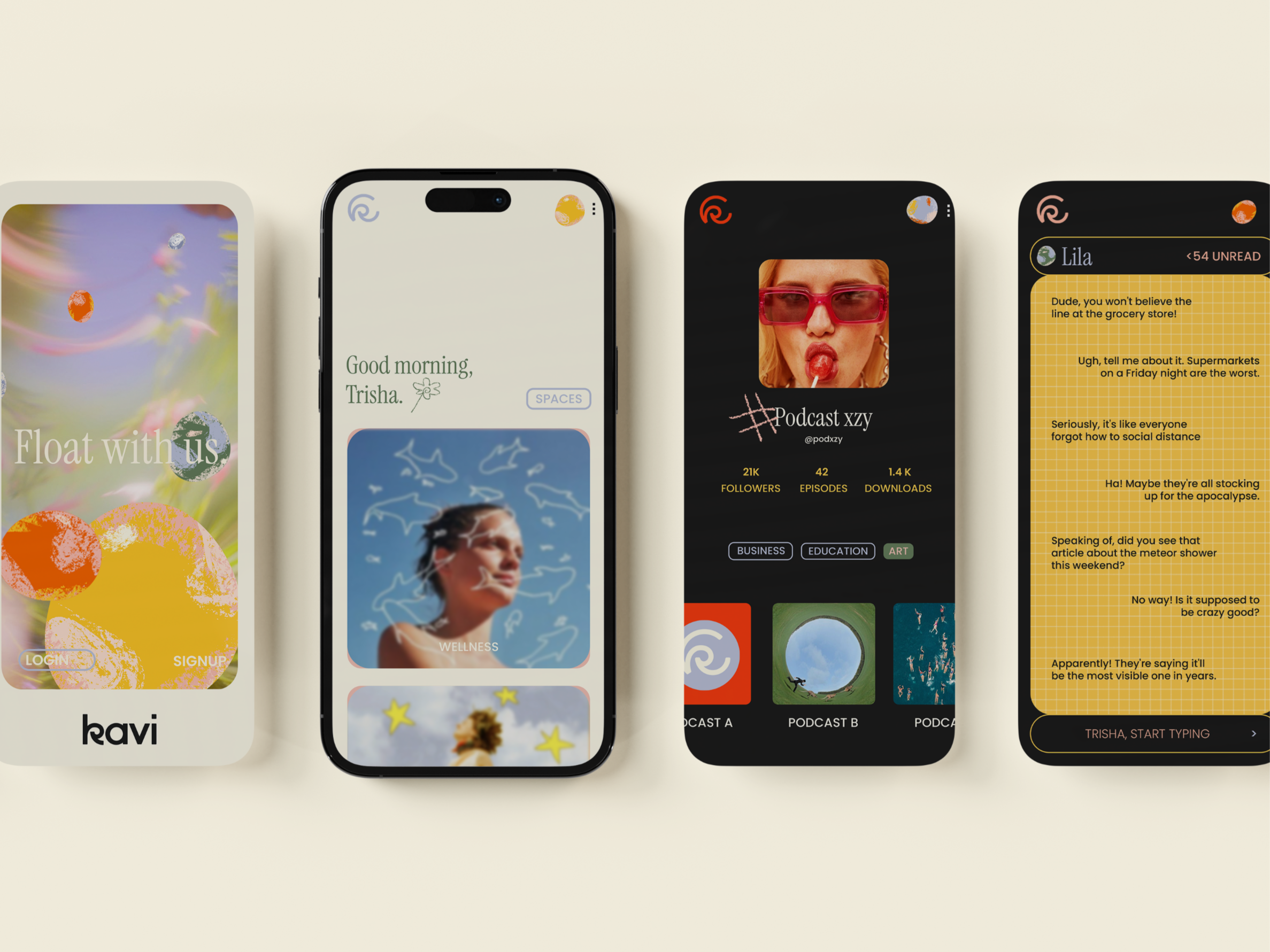
Illustration Kit: The illustration kit, featuring crayon textures and bubbles, adds a playful and whimsical element to the brand. The bubbles also serve as user avatars, symbolizing the idea that every woman is a unique individual contributing to the larger community.
The Result:
Kavi's brand identity successfully conveys a sense of community, support, and empowerment. The water-inspired imagery and diary-like aesthetic create a welcoming and inviting atmosphere, encouraging women to share their stories and connect with others. The brand's focus on fluidity and adaptability reflects the diverse experiences and perspectives of women, making Kavi a truly inclusive and supportive platform.
Client
Year
Location
Scope of Work
Kavi
2024
Mumbai
Brand Identity and Illustrations
Kavi is an online community platform designed specifically for women. It aims to provide a safe and supportive space where women can express themselves through poetry, share their experiences, and connect with others. The platform's mission is to empower women and allow them to flourish through every stage of life. Essentially, Kavi is a digital oasis where women can find inspiration, encouragement, and a sense of belonging.
Problem Statement:
Kavi sought a brand identity that would resonate with a diverse community of women and create a safe, supportive online space. The challenge was to develop a brand that reflected the fluidity, adaptability, and strength of women while also fostering a sense of community and belonging.
Design Strategy:
Our approach was to draw inspiration from the natural element of water, which embodies many of the qualities we associate with women. By leveraging the metaphor of water, we aimed to create a visually appealing and emotionally resonant brand that would connect with Kavi's target audience.
Design Focus:
-
Water-Inspired Logo: The Kavi logo, a stylized wave, symbolizes the fluidity, adaptability, and strength of women. It also serves as a visual representation of the community, where women can flow together and share their experiences.
-
Diary-Inspired Aesthetic: To create a sense of intimacy and informality, we adopted a diary-like aesthetic with grids, handwritten typefaces, and a soothing color palette. This design approach reflects the personal nature of the content shared on the app and reinforces the idea of a safe, private space.
-
Illustration Kit: The illustration kit, featuring crayon textures and bubbles, adds a playful and whimsical element to the brand. The bubbles also serve as user avatars, symbolizing the idea that every woman is a unique individual contributing to the larger community.
The Result:
Kavi's brand identity successfully conveys a sense of community, support, and empowerment. The water-inspired imagery and diary-like aesthetic create a welcoming and inviting atmosphere, encouraging women to share their stories and connect with others. The brand's focus on fluidity and adaptability reflects the diverse experiences and perspectives of women, making Kavi a truly inclusive and supportive platform.


