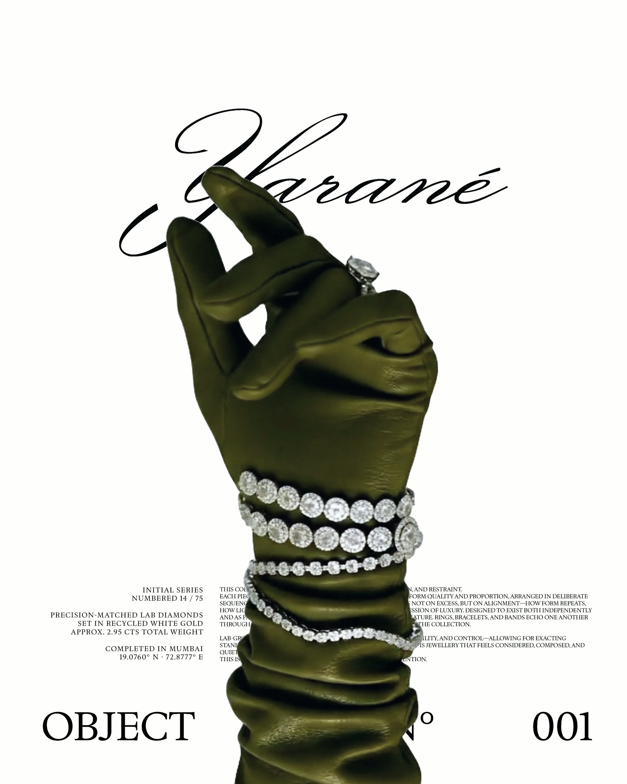
We worked with House of Yarané to develop a complete brand identity, monogram system, and stationery design for a lab-grown diamond luxury brand redefining heritage through restraint.
Client
Year
Location
Scope of Work
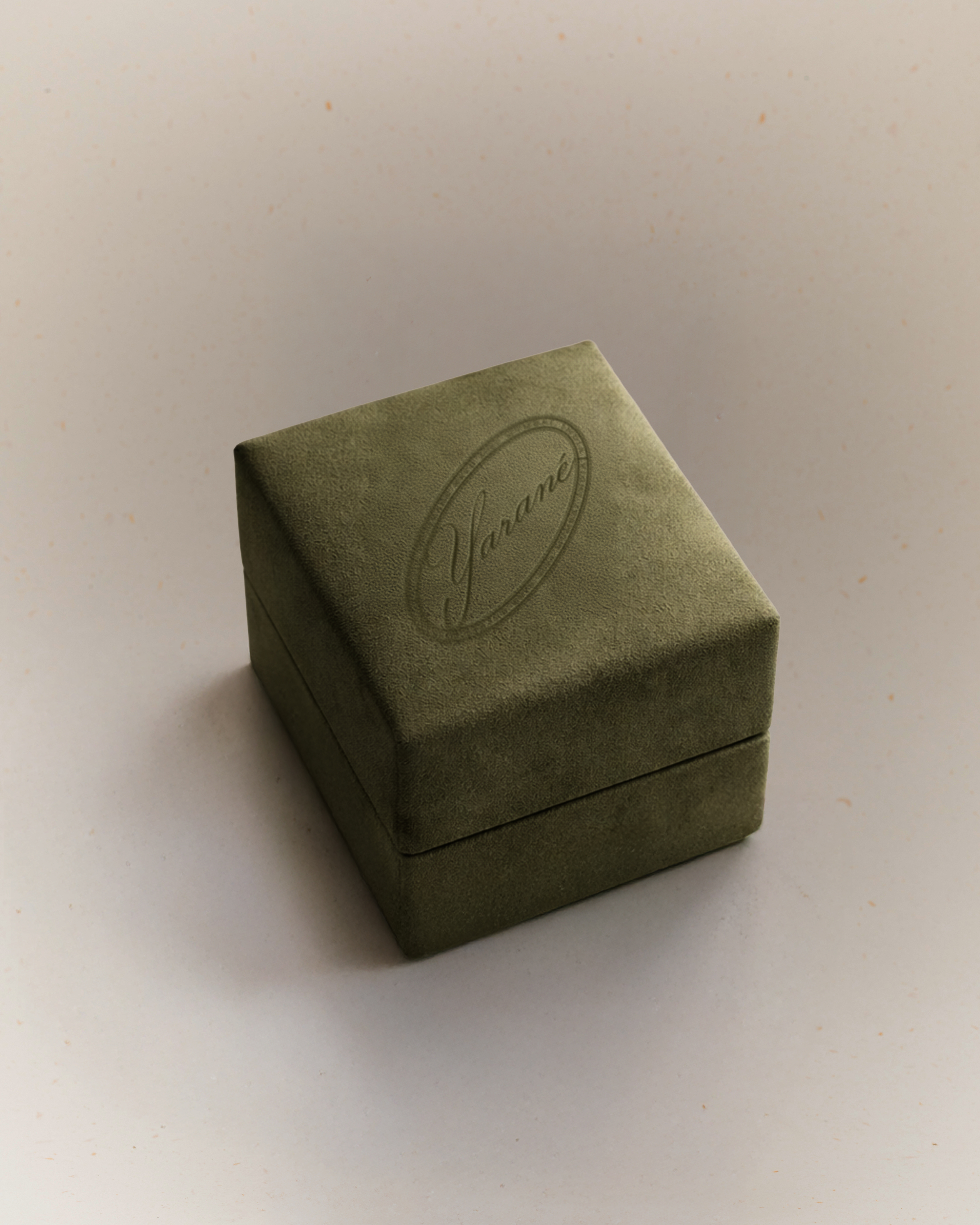
House of Yarané
2025
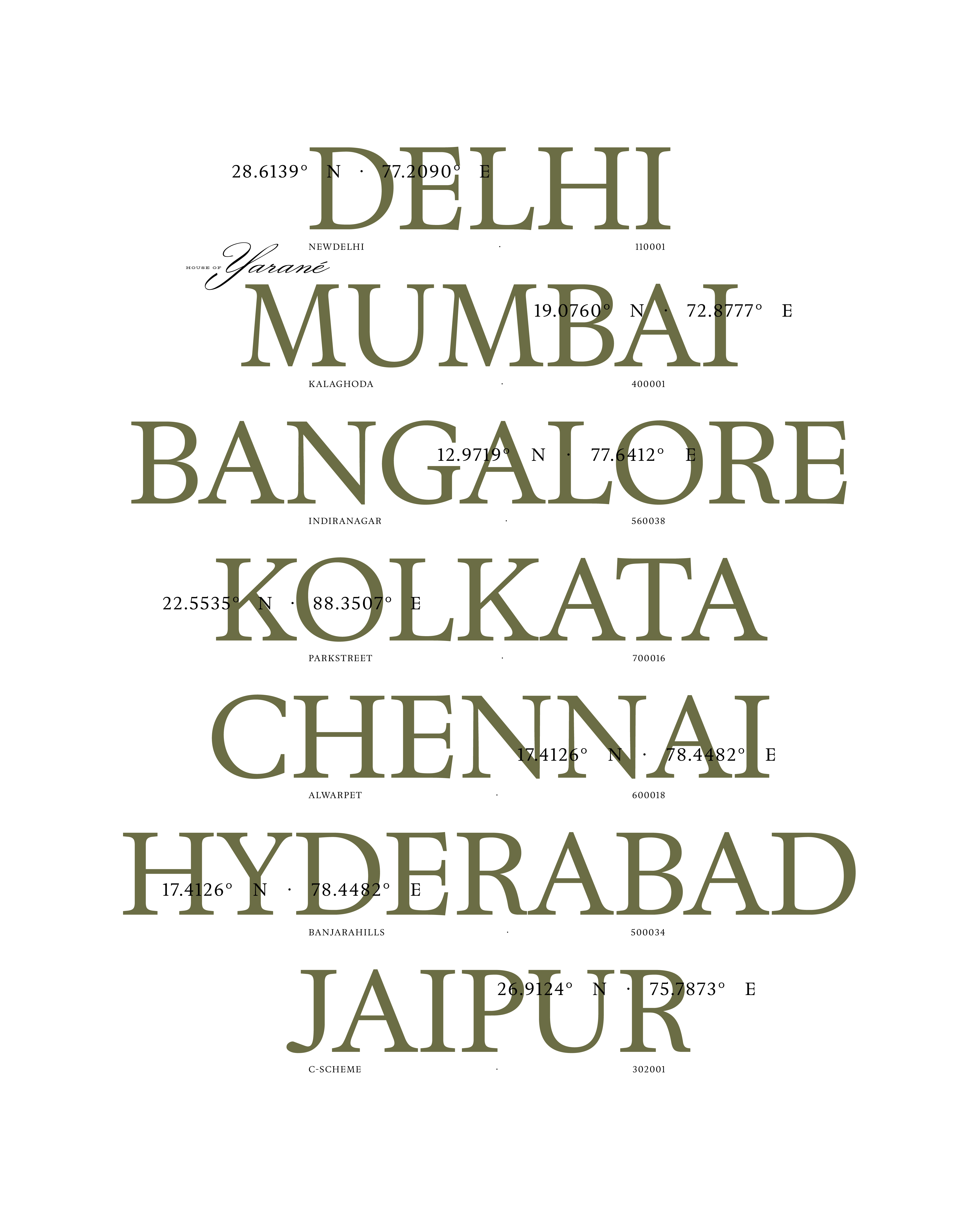
Mumbai
Custom Monogram, Visual Identity System, Packaging Design, Stationery Suite and Brand Collateral, Brand Guidelines, Digital Invoice Templates
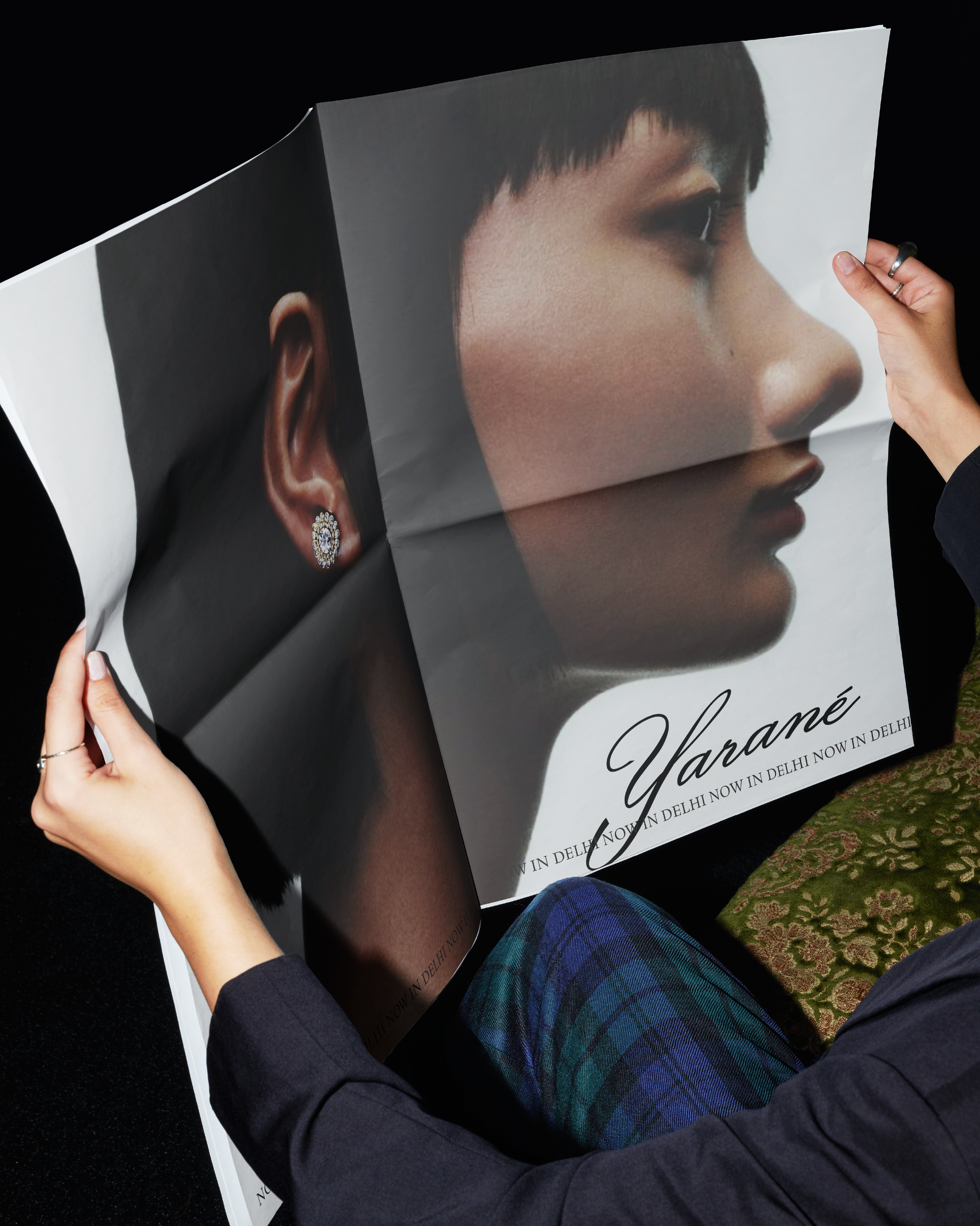
House of Yarané Brand Identity & Stationery | Lab-Grown Diamond Branding
Erth Co, a graphic design studio in India, developed a complete brand identity, custom monogram system, and luxury packaging for House of Yarané, a lab-grown diamond brand redefining heritage through restraint.
The Challenge
House of Yarané entered a crowded luxury jewellery market where most lab-grown diamond brands lean towards friendly, literal, or overly accessible aesthetics. The challenge: create a brand identity that felt different—mysterious, confident, and heritage-driven without being loud.
Brand Strategy: Mystery Over Accessibility
We studied the competitive landscape of lab-grown diamond brands and luxury jewellery identities. The insight was clear: Yarané needed to resist category conventions.
Strategic Direction:
-
Darker palette for sophisticated grounding
-
Geometric forms creating recognizable patterns
-
Unconventional oval emblem—archival, deliberate, unexpected
-
Visual language inspired by heritage fashion houses
The goal: build presence slowly and deliberately, like legacy luxury brands.
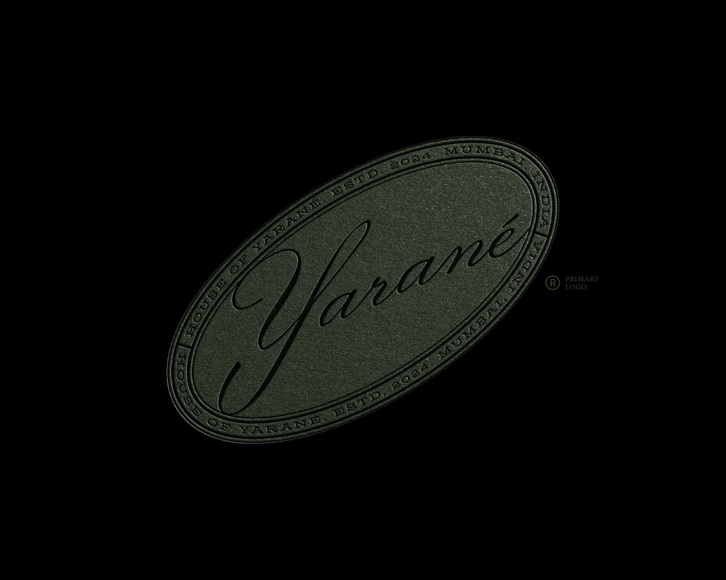
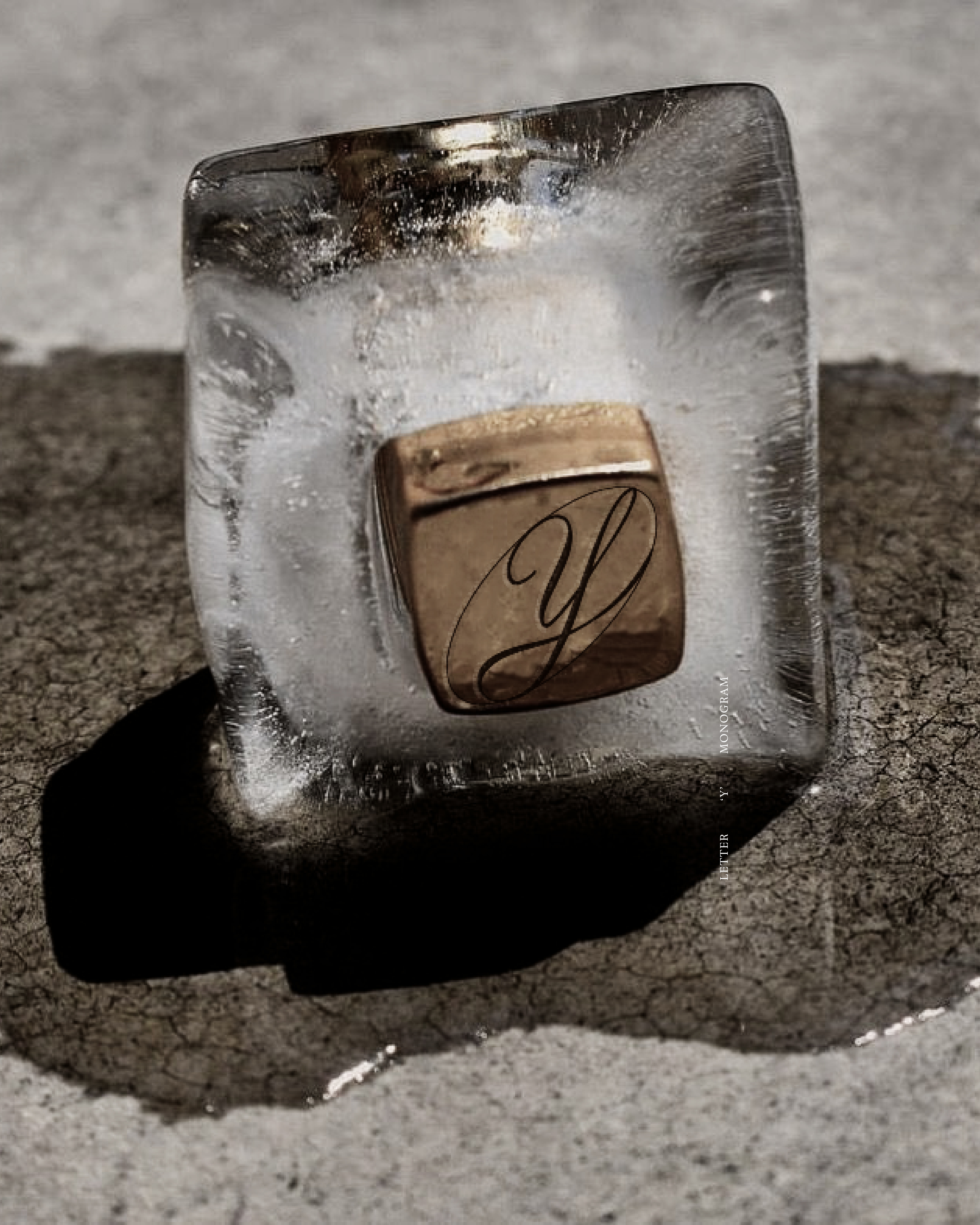
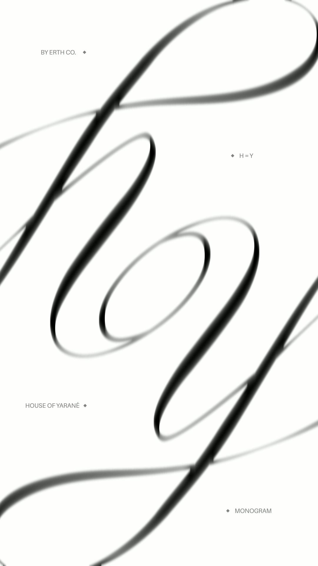
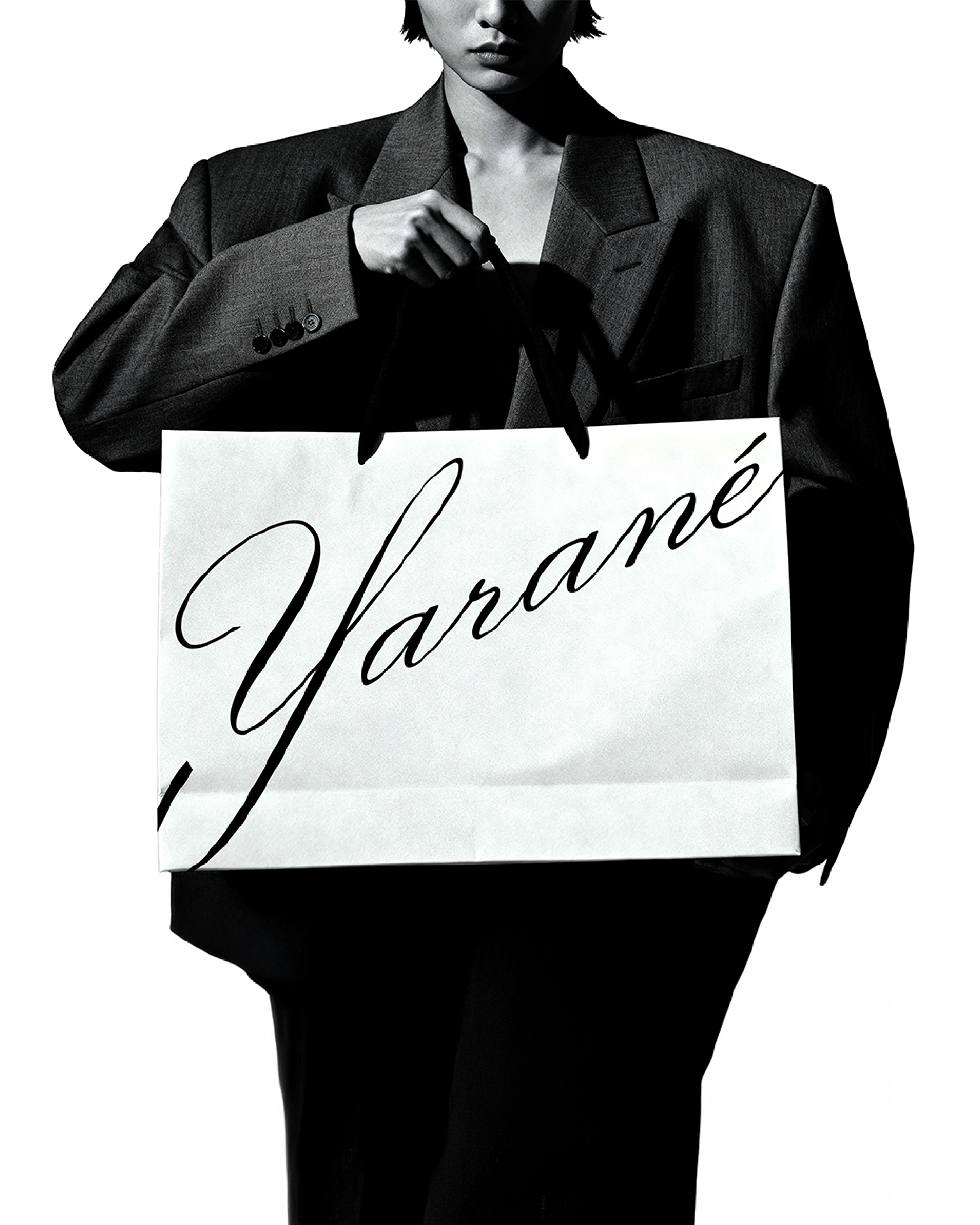
The HOY Monogram: Engineered Symmetry
The House of Yarané monogram is built entirely from a single letterform: the Y from Yarané.
How It Works:
-
Y flipped to create H
-
Negative space forms O
-
Perfect 360° rotational symmetry
-
Reads identically at every 90° rotation
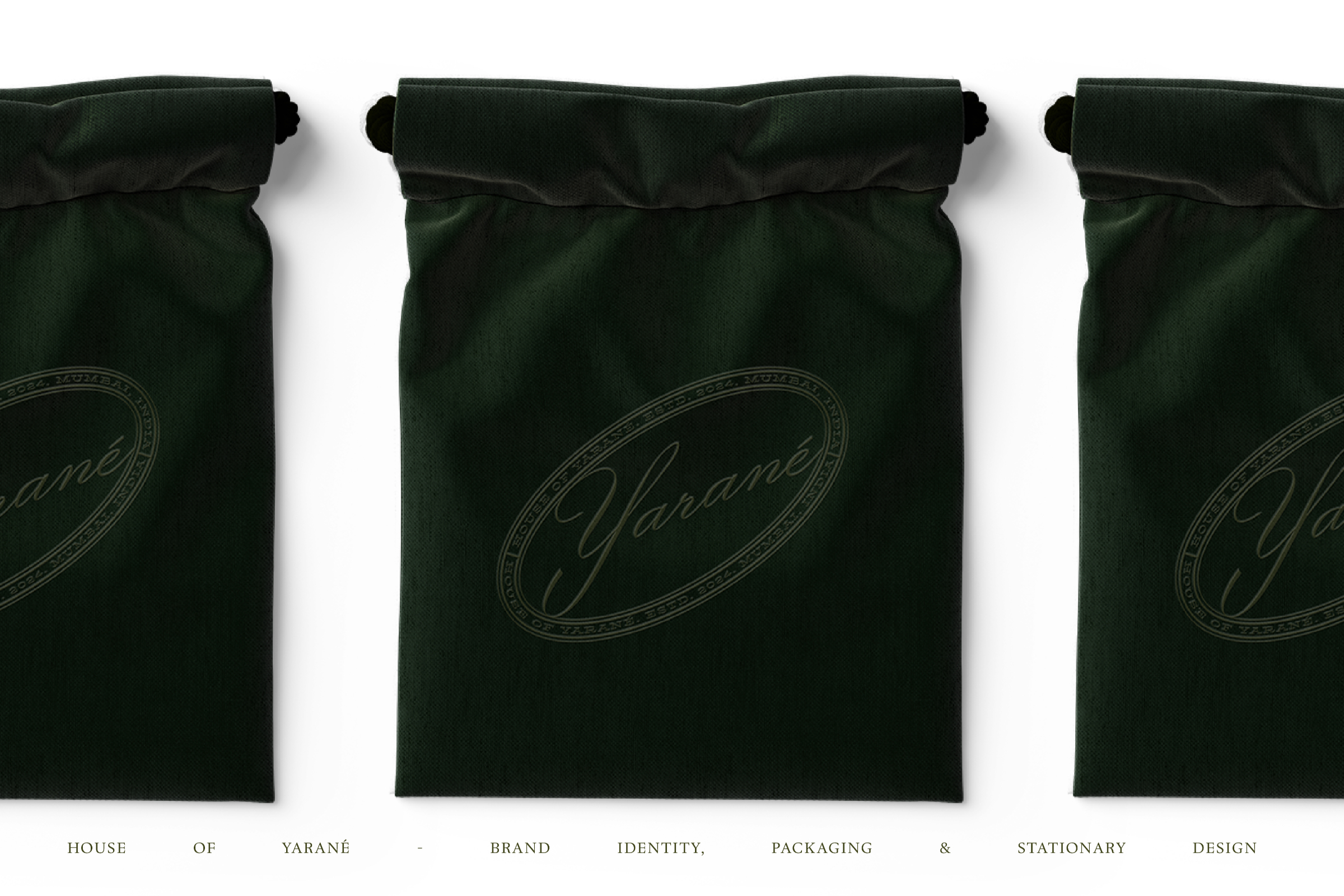
This engineered design functions across embossing, debossing, foil stamping, and digital applications at any scale. Custom script letterforms balance refinement with intentional structure.
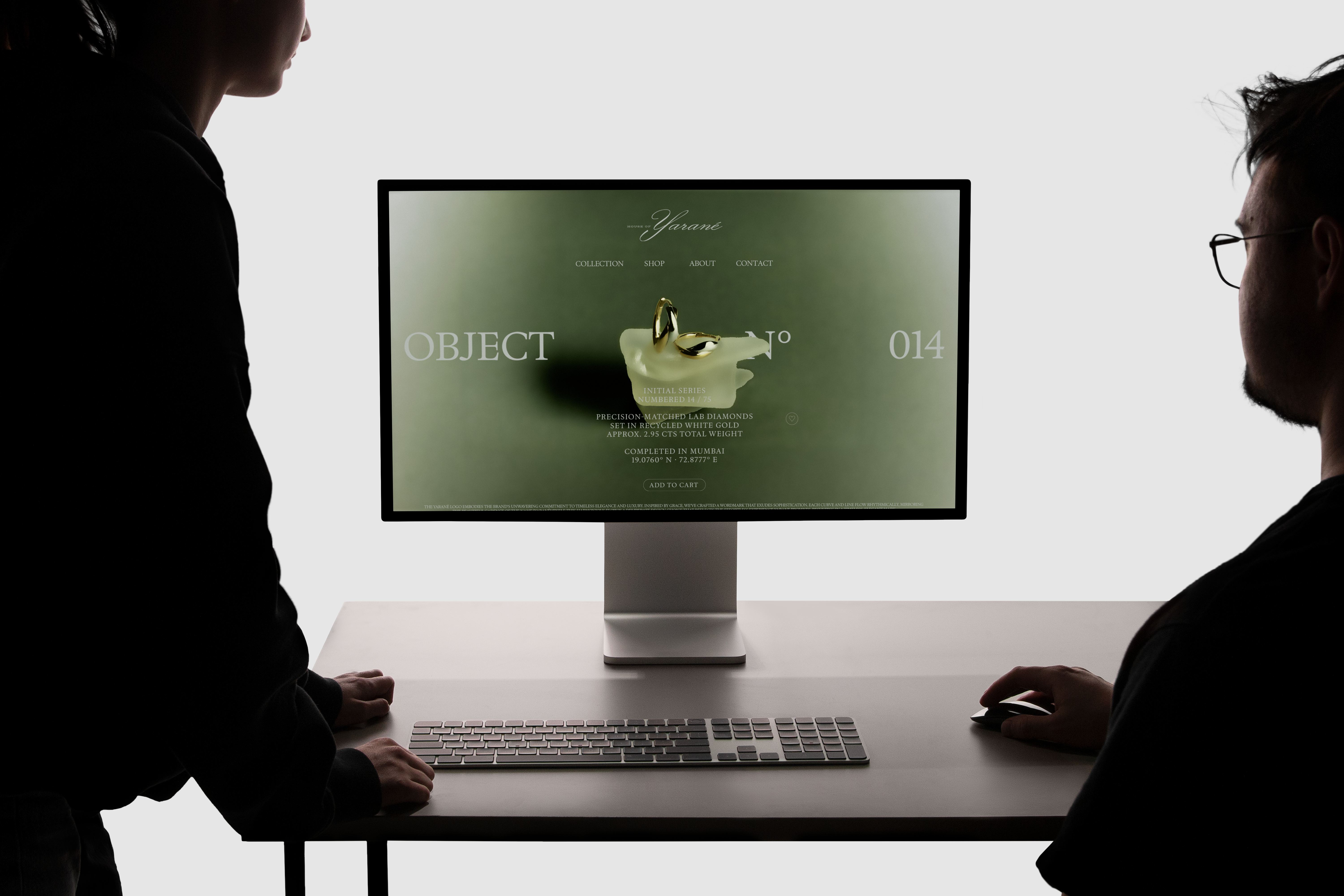
Visual Identity System
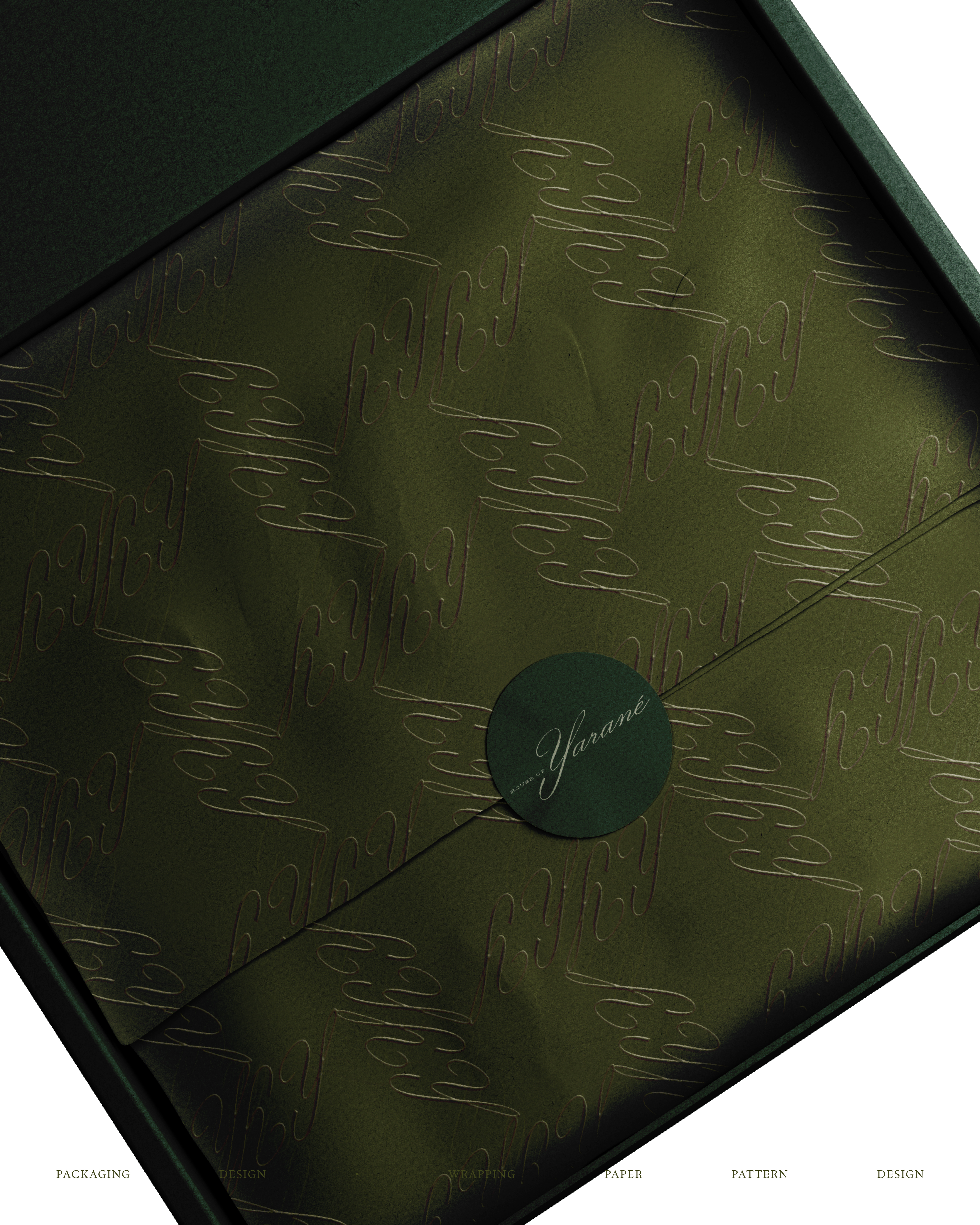
Color Palette
Darker, grounded tones reject the bright, friendly aesthetic common in lab-grown diamond branding. The palette reinforces mystery and premium positioning.
Geometric Pattern System
Repeating forms create recognizable brand language. Structured enough for consistency, flexible enough to scale.
The Oval Device
An archival containing shape reminiscent of heritage luxury identities. The oval creates instant brand recognition across applications.
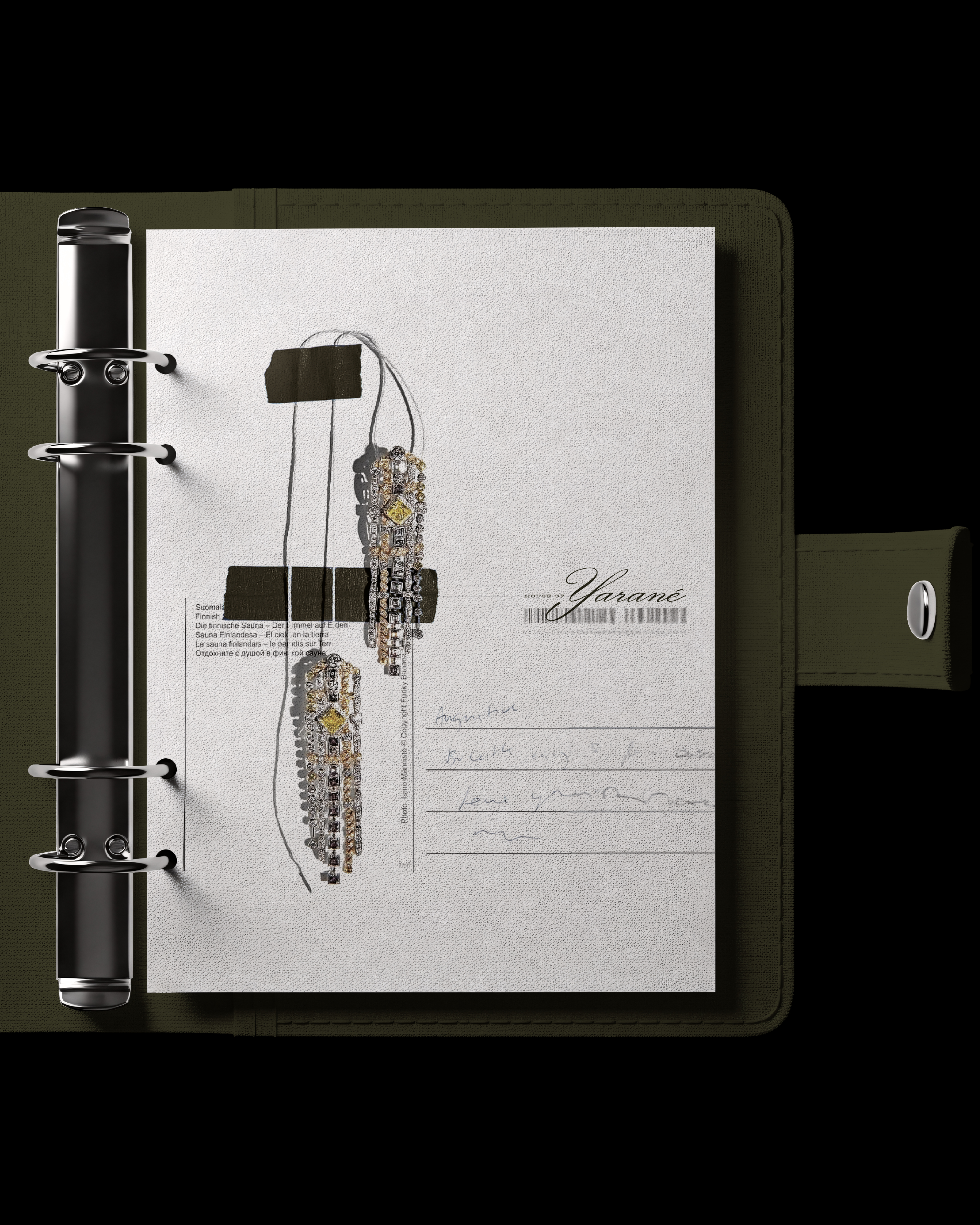
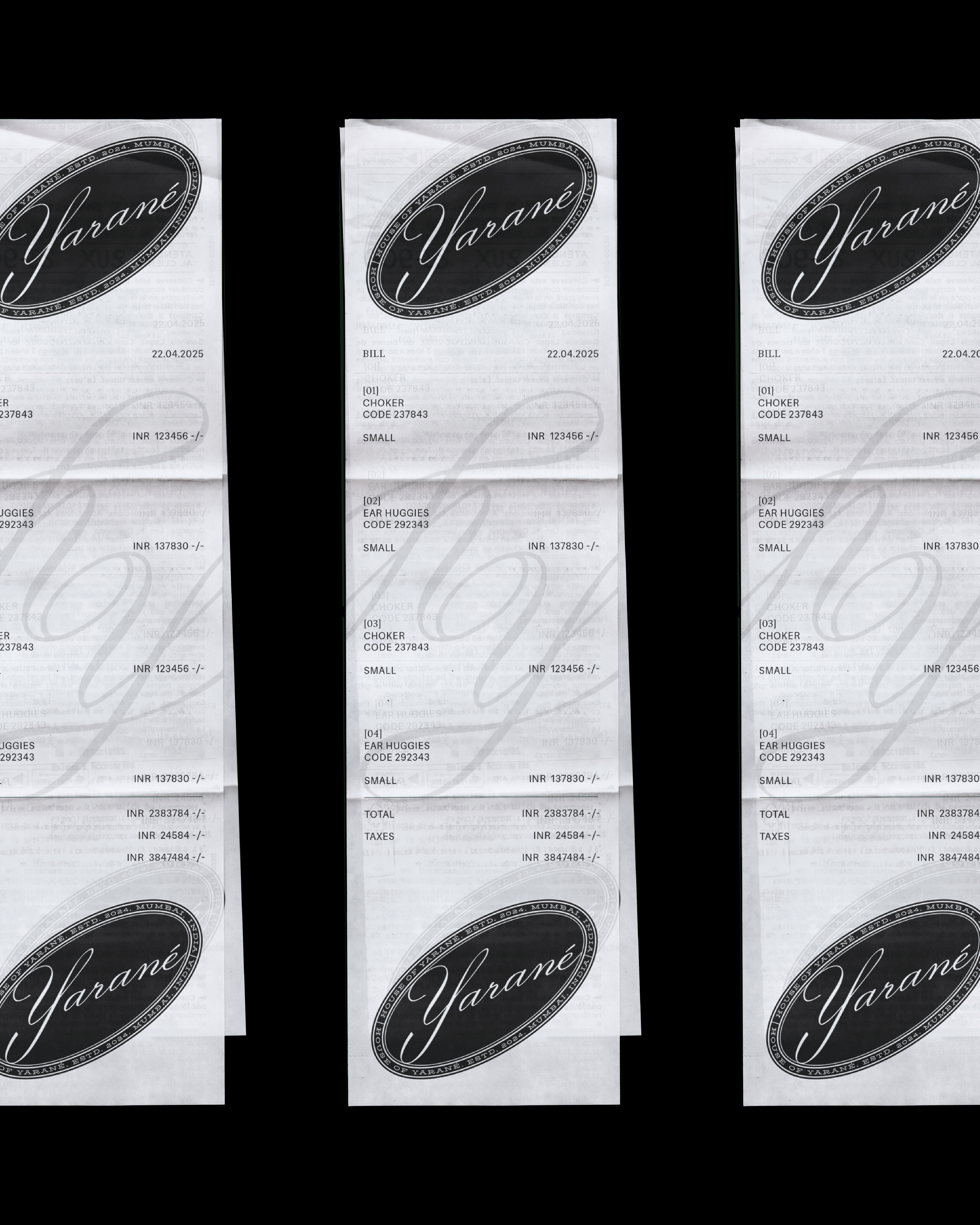
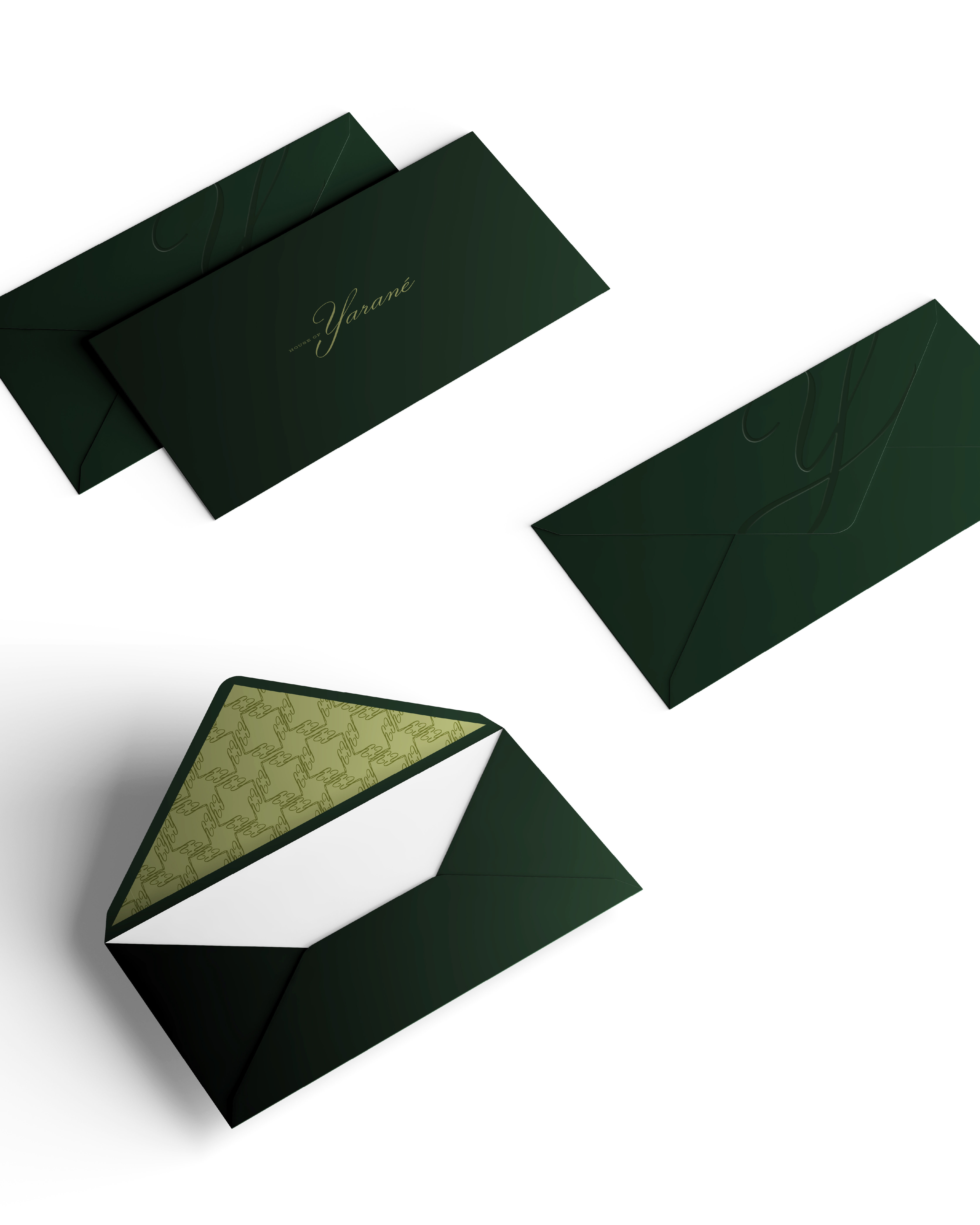
Stationery & Brand Collateral
A refined suite extending the restrained luxury aesthetic:
-
Business cards with embossed monogram
-
Letterheads and correspondence templates
-
Envelopes and branded mailers
-
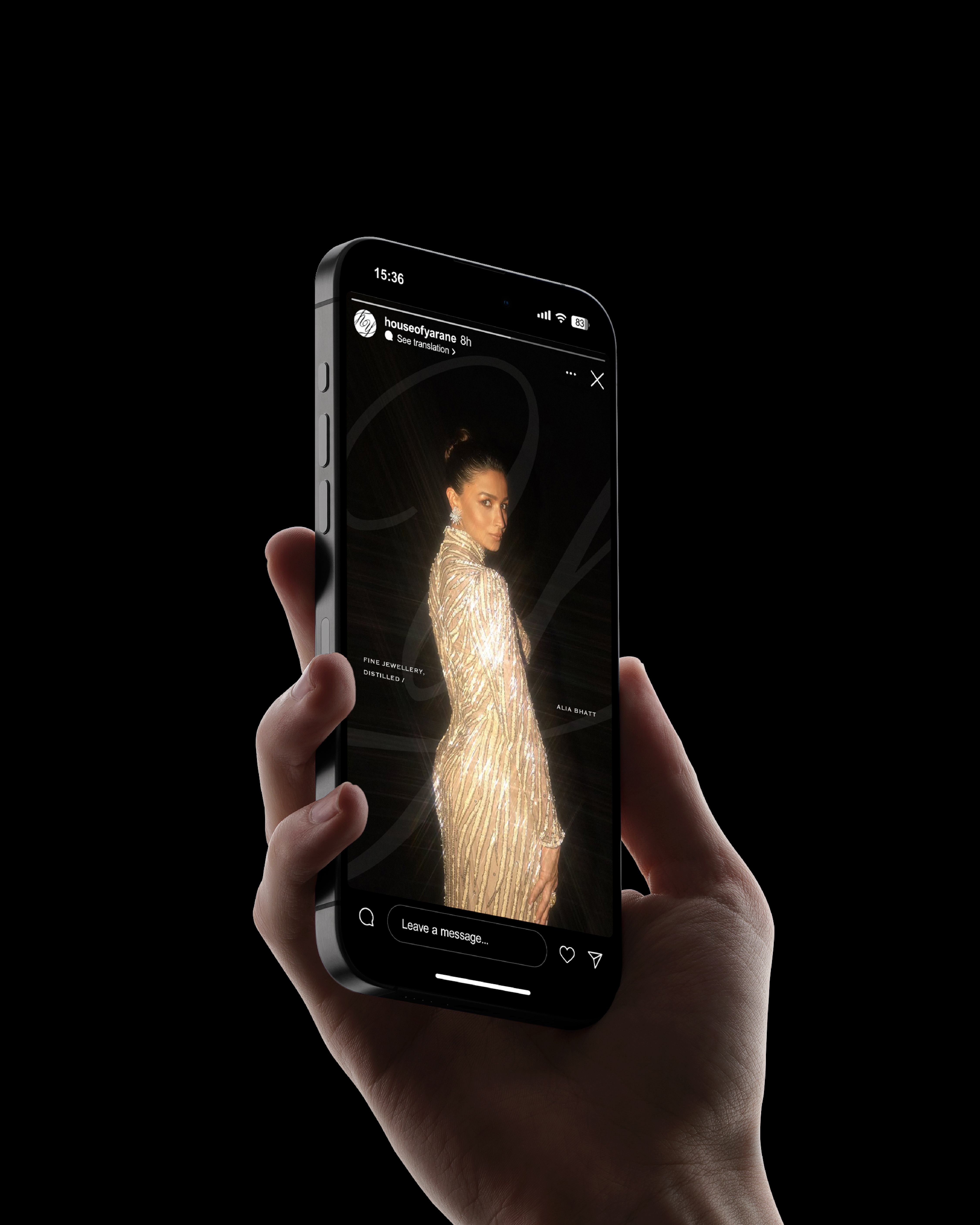
Digital email and presentation templates
-
Comprehensive brand guidelines
Every touchpoint reinforces composed confidence over eager attention-seeking.
Design Philosophy
This project reinforced that strategy isn't a separate step it's the framework holding everything together.
Core Principles:
-
Mystery over accessibility
-
Heritage over trend
-
Restraint over excess
-
Structure over decoration
From identity to packaging to stationery, every decision aimed to build presence deliberately, not chase trends.
Results
House of Yarané now has a complete visual identity system that:
-
Differentiates in a crowded lab-grown diamond market
-
Functions seamlessly across digital and physical touchpoints
-
Scales efficiently as the brand grows
-
Reflects premium product positioning
The identity positions House of Yarané as heritage-driven luxury quiet, confident, built to last.
Client
Year
Location
Scope of Work
Bowl Curry
2023
Mumbai
Brand Identity and Illustrations
The Challenge:
Bowl Curry, the brainchild of celebrity chef Munna Maharaj, sought a brand refresh to better connect with a new generation. Their target audience? Young adults living away from home, craving the comforting flavors of Indian cuisine. While their existing branding was successful, it didn't fully resonate with this specific demographic.
Our Design Strategy:
We knew nostalgia could be a powerful tool for building trust. So, we crafted a brand identity that evokes a sense of home and familiarity, leveraging the power of beloved Indian brands like Haldiram's, Frooti, and Dabur.
Design Focus:
-
Building Trust Through Nostalgia: The logo features an aged aesthetic, subtly referencing established Indian brands. This detail instantly connects with students abroad and others yearning for a taste of home.
-
Heritage & Expertise: The aged wordmark isn't just stylistic; it strategically reinforces Bowl Curry's culinary heritage and expertise.
-
Modern Functionality: The wordmark and emblem seamlessly blend functionality and visual appeal. The wordmark ensures clear communication across various formats, while the emblem cleverly hides the letter “C” within the “B,” allowing the brand to perform seamlessly at any scale.
The Result:
Bowl Curry's new brand confidently conveys its expertise while remaining fresh, easy, and accessible. It caters not only to students abroad (NRIs) but also to curious foodies and health-conscious eaters. This refresh positions Bowl Curry as the go-to option for enjoying authentic Indian flavors with ultimate convenience.