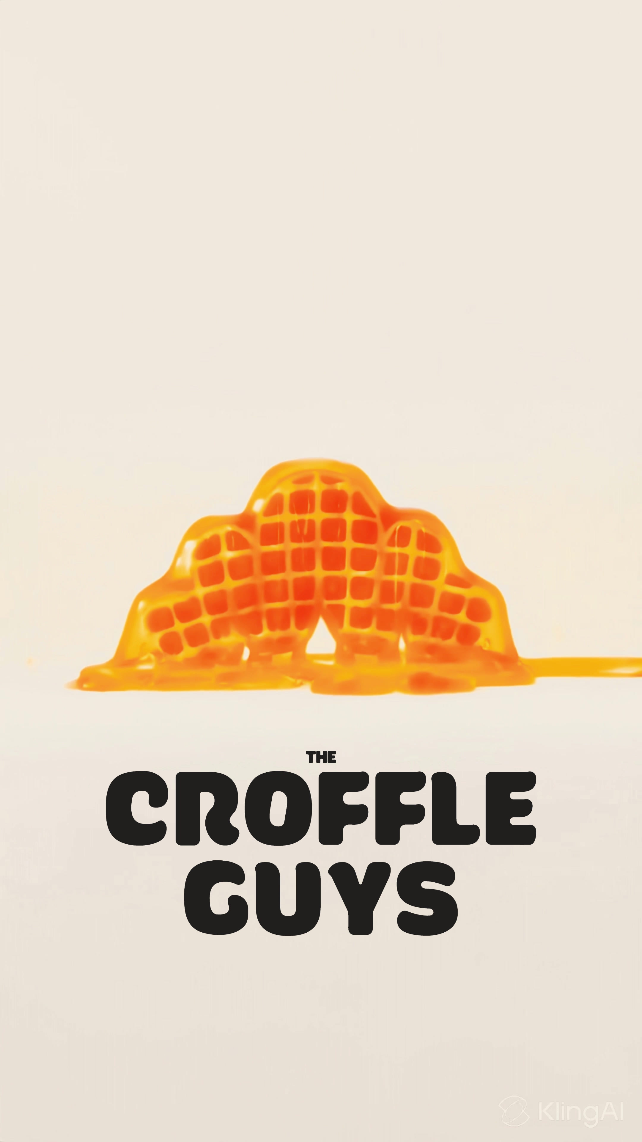
We worked with The Croffle Guys to develop a complete brand identity, packaging system, and menu design for India's first viral croffle QSR brand.
Client
Year
Location
Scope of Work
Recognition
The Croffle Guys
2025
Mumbai
Brand Identity Design, Logo Design, Custom Typography, Packaging Design, Menu Design, Digital Menu Boards, Store Signage, Environmental Graphics, 3D Rendering, Print Collateral, QSR Branding Strategy
Kyoorius Design Awards 2025 First List
Erth Co, a graphic design studio in India, developed a complete brand identity, packaging system, and menu design for The Croffle Guys, India’s first viral croffle QSR brand.
Brand Identity & Packaging Design for The Croffle Guys
The Croffle Guys are going viral. Behind the croffle craze is a comprehensive brand identity and packaging system designed to introduce a new food category and scale it nationwide.
The Challenge
Create a brand identity for an entirely new food category in the Indian QSR market. The croffle, a hybrid of croissant and waffle, needed visual language that could communicate what it is, why it's craveable, and why it matters, all at a glance.
The brand required multiple touchpoints: packaging that becomes shareable content, menus optimized for quick decisions, store signage visible from across the street, and a complete identity system scalable for rapid expansion.
Logo Design & Brand Mark
A logomark that fuses food forms
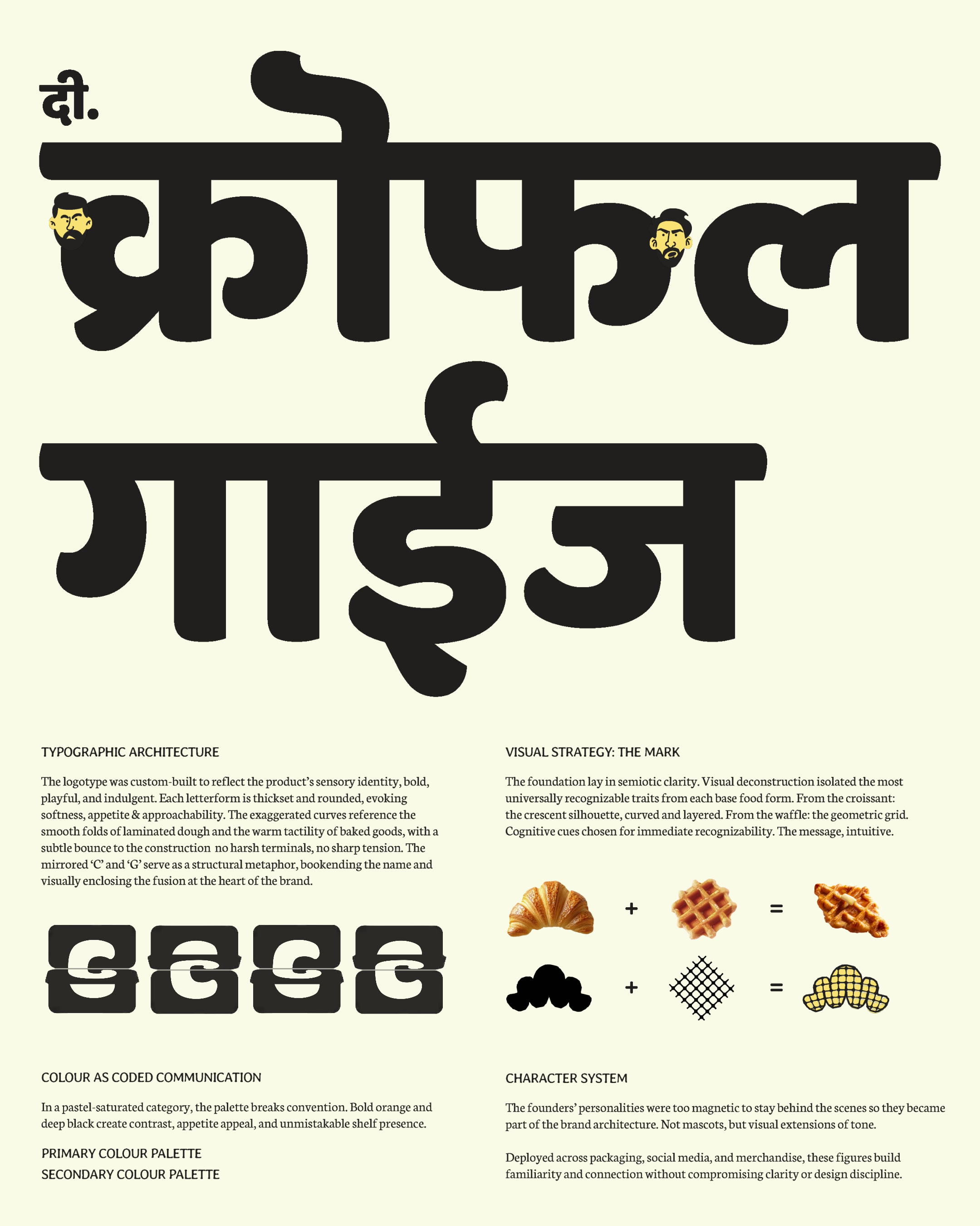
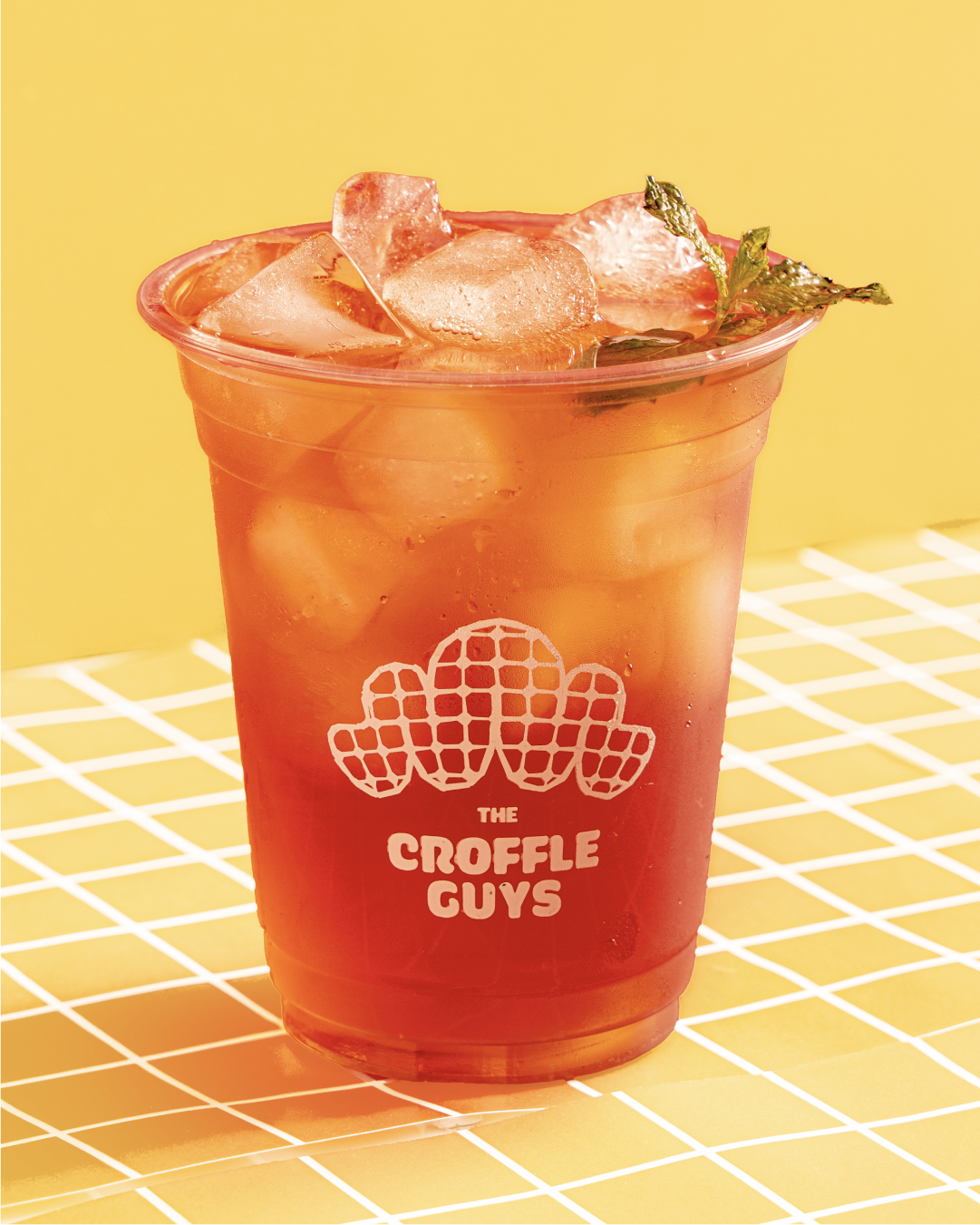
The silhouette combines the crescent curve of a croissant with the grid structure of a waffle. Instantly recognisable, instantly appetising. The mark communicates the product category without explanation.
Custom typography
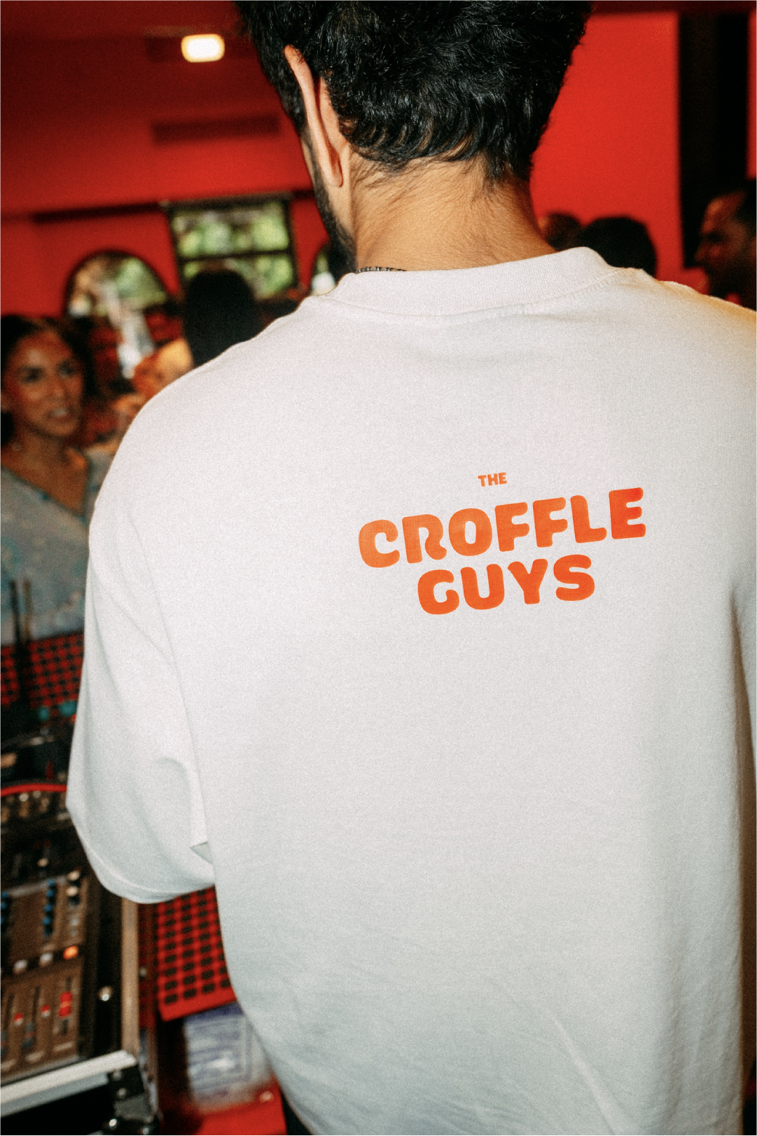
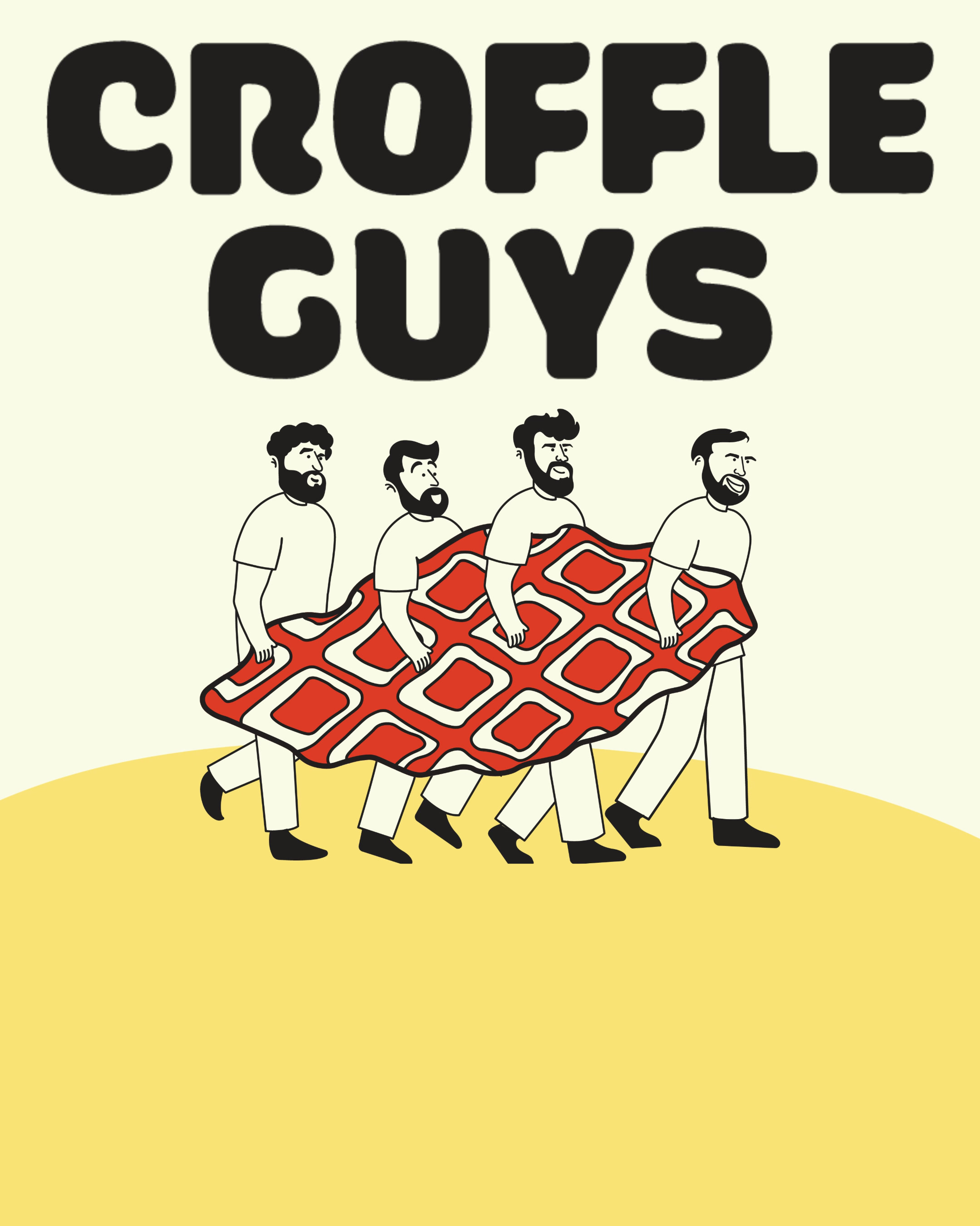
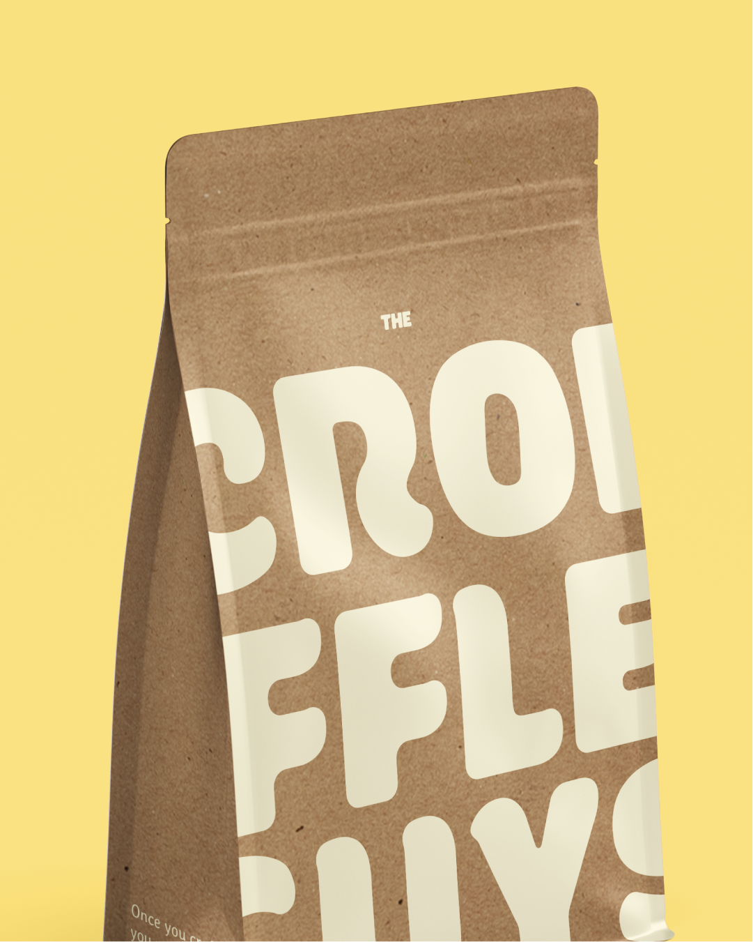
Thickset, rounded, soft-edged letterforms. Every character feels plump and bite-worthy. The mirrored C and G act as structural bookends, creating memorable visual rhythm while balancing playfulness with legibility across digital screens, print menus, store signage, and packaging labels.
Packaging Design & Brand System
Designed to be shared
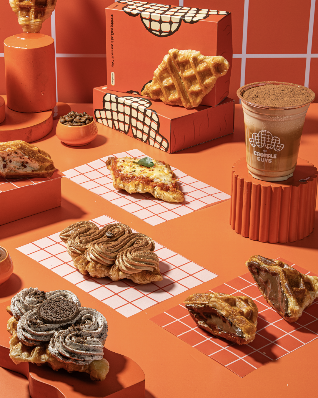
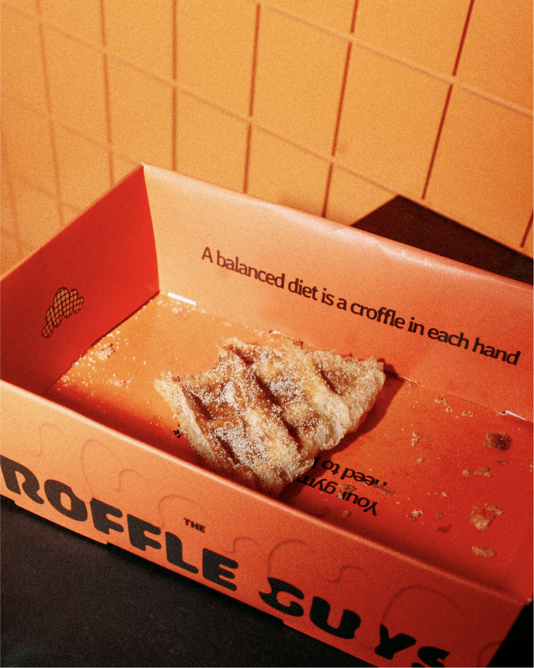
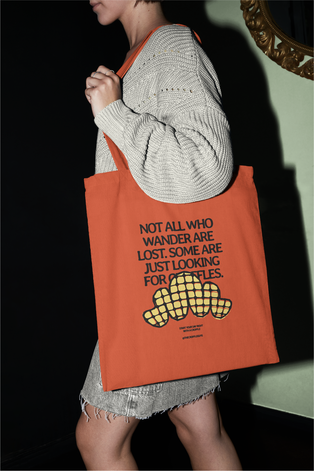
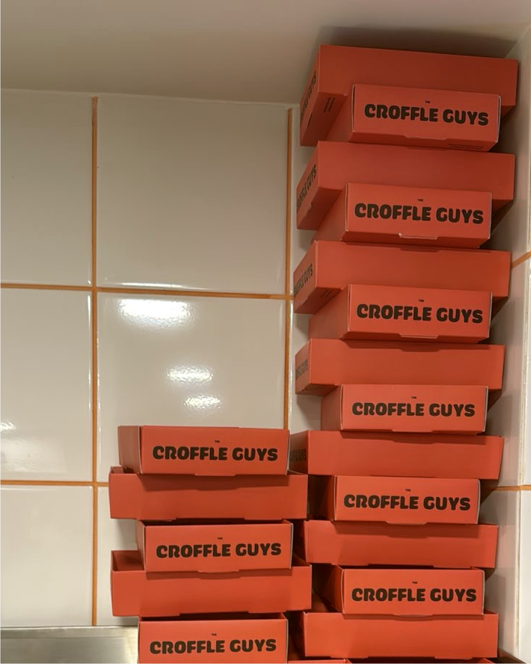
Every design choice was made for shareability. Bold, bright orange for instant visibility in crowded QSR spaces and on social media feeds. Playful, provocative copy across every panel: "Your gym trainer doesn't need to know about this." "Best thing you'll put in your mouth today."
Complete packaging ecosystem
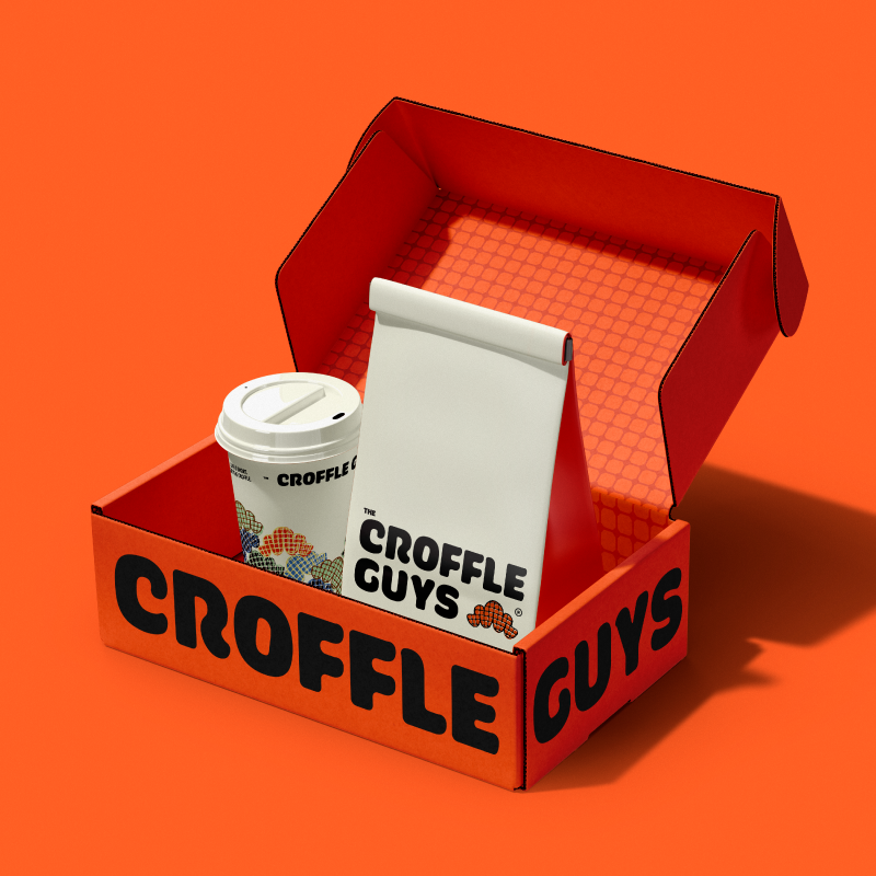
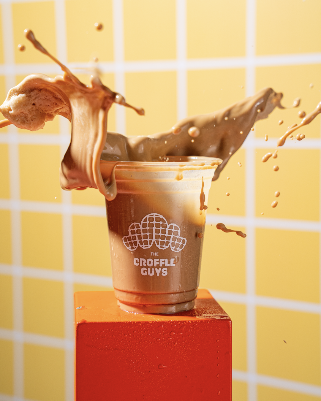
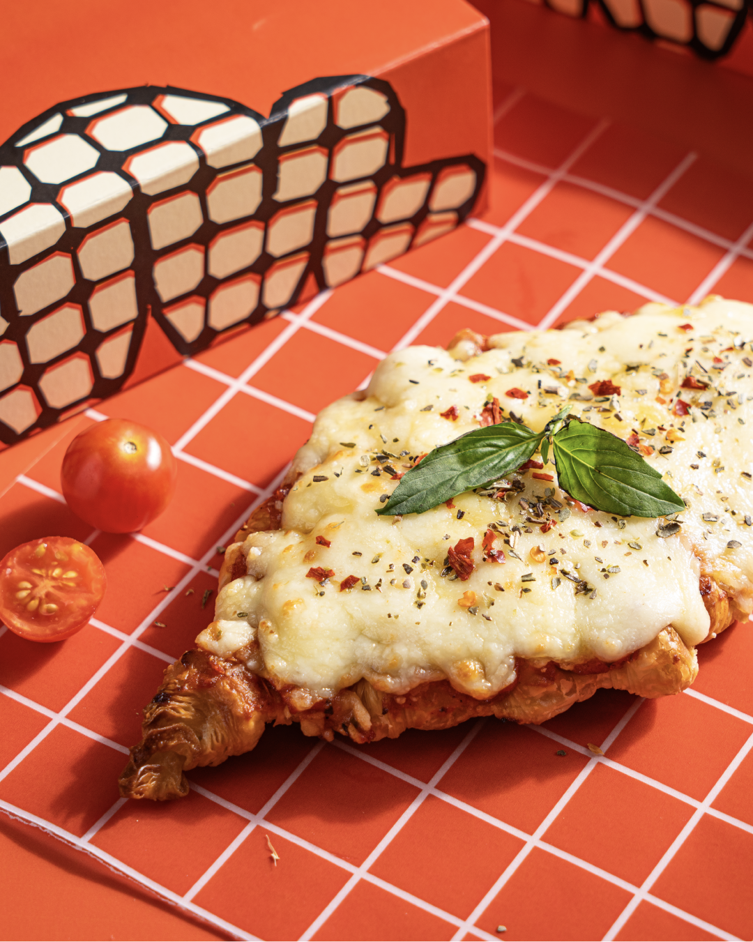
Delivery boxes, food trays, cups and cup sleeves, kraft mailers, stickers, and branded collateral. We built the packaging in 3D renders, a service we offer for brands visualizing products before production.
Menu Design & Digital Strategy
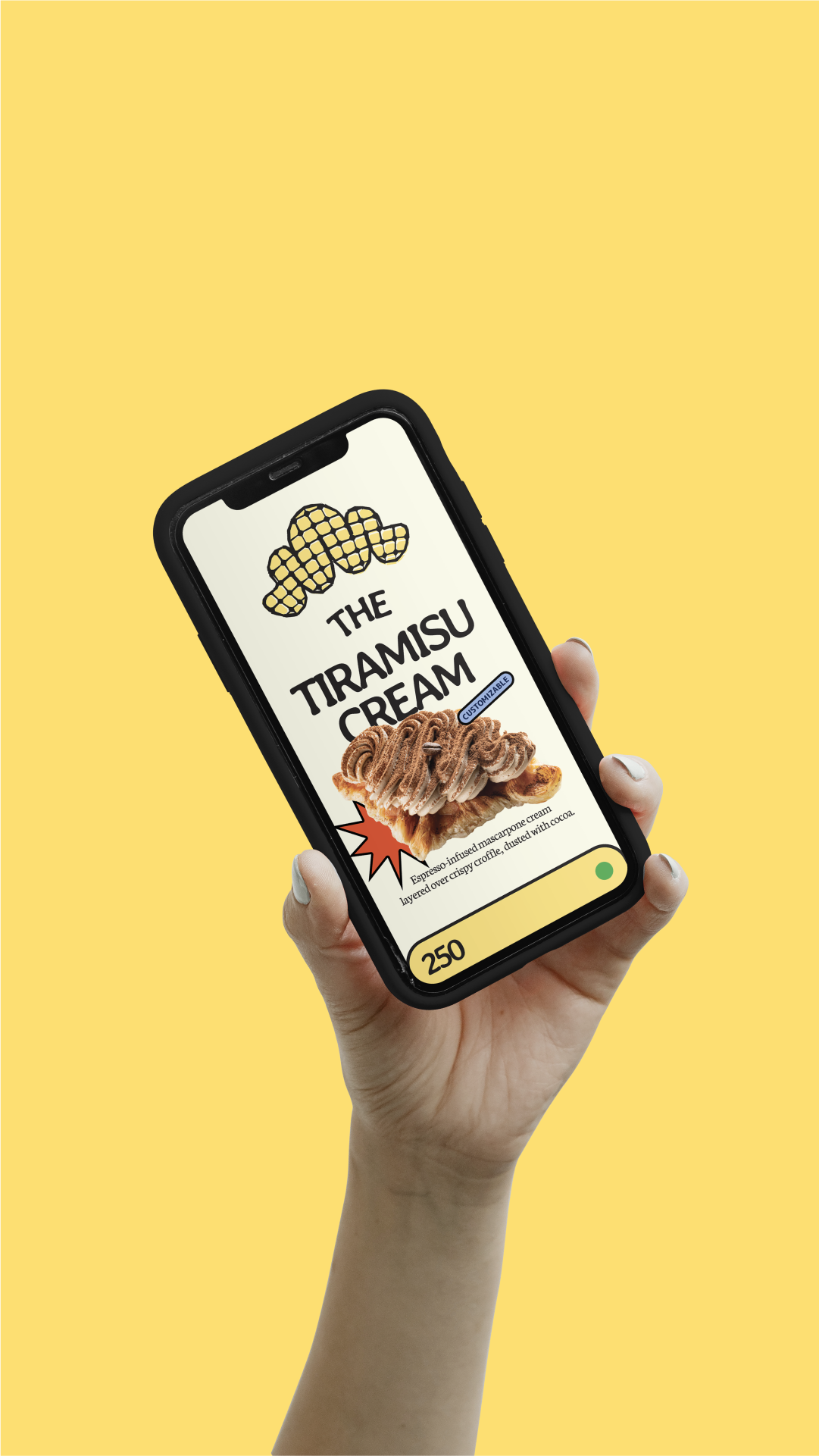
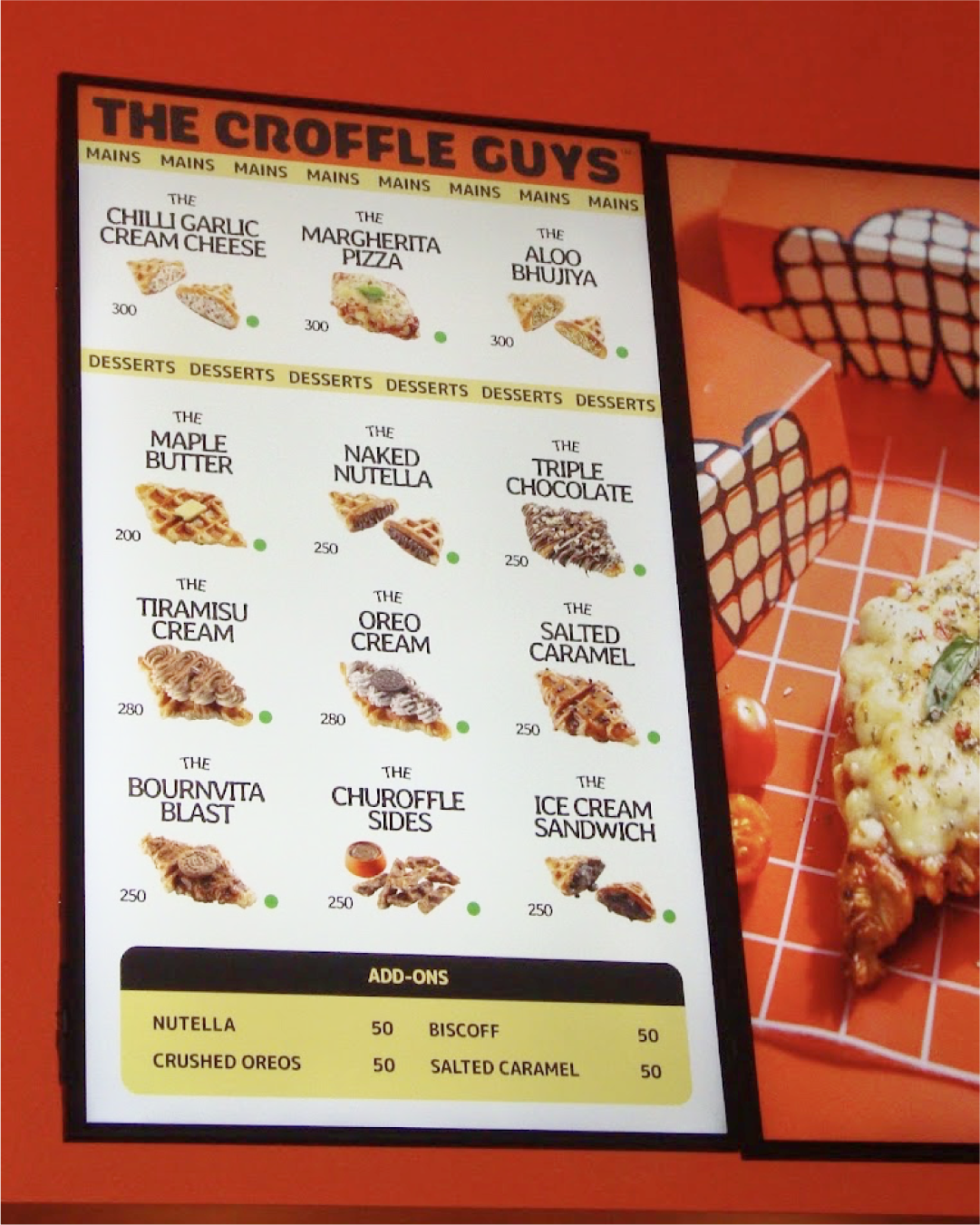
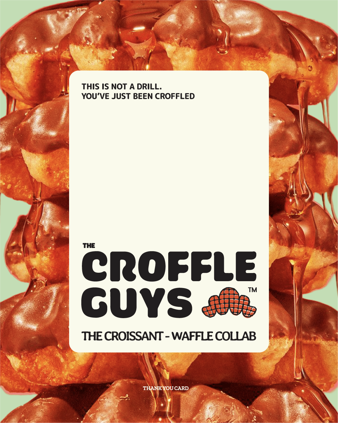
We designed across print and digital: in-store menus, digital menu boards, store signage, thank-you cards, promotional coupons, and branded merchandise.
The menu as selling tool
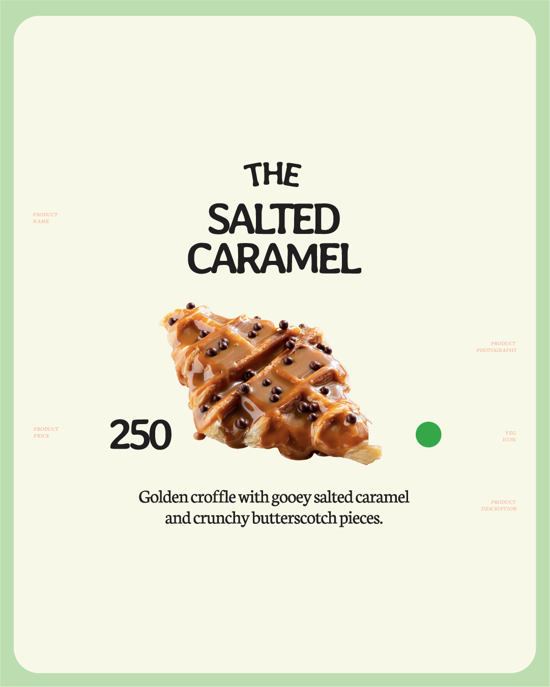
Every layout decision made to guide the eye and trigger cravings:
-
Bold product names that read at a glance
-
Macro food photography highlighting texture and indulgence
-
Clean pricing and benefit-first descriptions for fast decision-making
-
Sharp visual hierarchy — navigation feels instinctive
-
Typography calibrated for real-world viewing, readable from counter and queue
Image-heavy formats inspired by classic QSR legends, reimagined for Instagram-native audiences.
Store Signage & Environmental Design
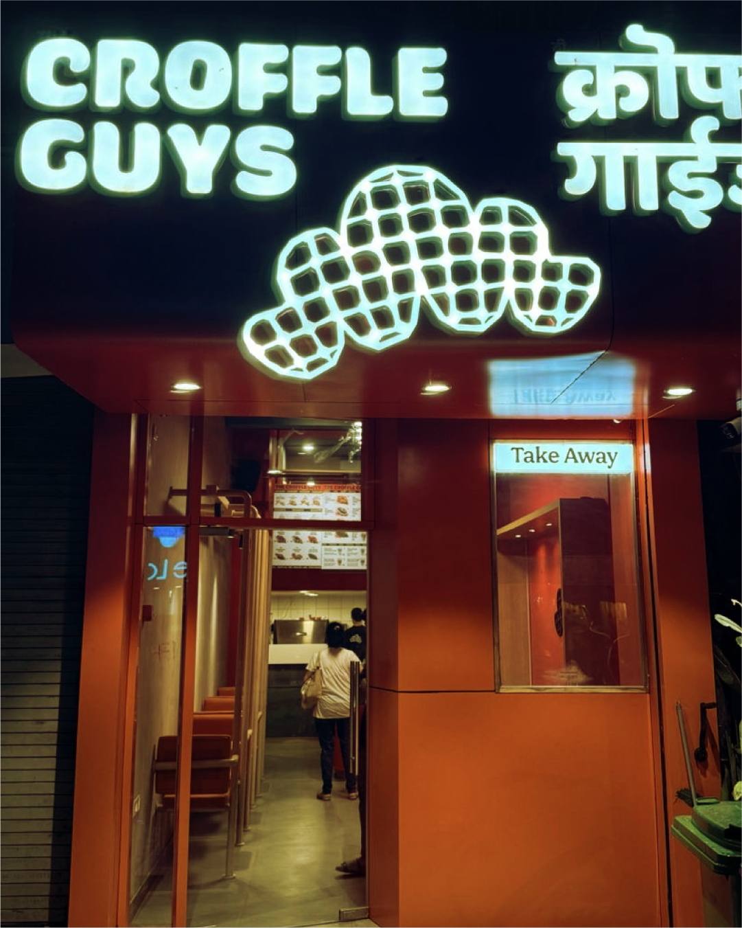
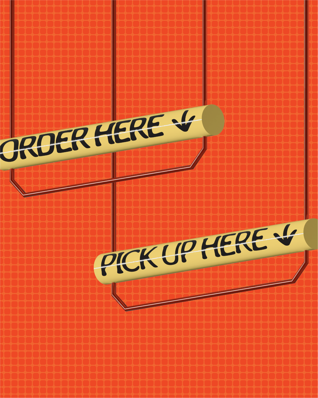
Typography and color calibrated for high-visibility retail environments. Signage bold enough to be seen from the street, clear enough to guide ordering, on-brand enough to reinforce identity at every touchpoint.
A cohesive system anchored by digital-first menu strategy, viral packaging, and environmental graphics built for scale.
Brand Strategy & Design Direction
Vibrant and appetite-driven. Nothing subtle. Everything intentional. A brand built to cut through the noise of the Indian QSR landscape and establish a new food category in the cultural conversation.
From logo to packaging to in-store experience, every element reinforces one idea: this is something new, something fun, something worth trying and sharing.
Recognition & Impact
Selected for the Kyoorius Design Awards 2025 First List, recognizing excellence in brand identity and packaging design in India.
The Croffle Guys demonstrates what's possible when brand identity, packaging design, digital strategy, and storytelling align. A full-scale project that introduced a new food category to India and made it stick.
Client
Year
Location
Scope of Work
Bowl Curry
2023
Mumbai
Brand Identity and Illustrations
The Challenge:
Bowl Curry, the brainchild of celebrity chef Munna Maharaj, sought a brand refresh to better connect with a new generation. Their target audience? Young adults living away from home, craving the comforting flavors of Indian cuisine. While their existing branding was successful, it didn't fully resonate with this specific demographic.
Our Design Strategy:
We knew nostalgia could be a powerful tool for building trust. So, we crafted a brand identity that evokes a sense of home and familiarity, leveraging the power of beloved Indian brands like Haldiram's, Frooti, and Dabur.
Design Focus:
-
Building Trust Through Nostalgia: The logo features an aged aesthetic, subtly referencing established Indian brands. This detail instantly connects with students abroad and others yearning for a taste of home.
-
Heritage & Expertise: The aged wordmark isn't just stylistic; it strategically reinforces Bowl Curry's culinary heritage and expertise.
-
Modern Functionality: The wordmark and emblem seamlessly blend functionality and visual appeal. The wordmark ensures clear communication across various formats, while the emblem cleverly hides the letter “C” within the “B,” allowing the brand to perform seamlessly at any scale.
The Result:
Bowl Curry's new brand confidently conveys its expertise while remaining fresh, easy, and accessible. It caters not only to students abroad (NRIs) but also to curious foodies and health-conscious eaters. This refresh positions Bowl Curry as the go-to option for enjoying authentic Indian flavors with ultimate convenience.
