We worked with Arjun Doshi to develop a comprehensive brand identity refresh and visual system for his Mumbai-based photography studio Vitamin Studios.
Client
Year
Location
Scope of Work
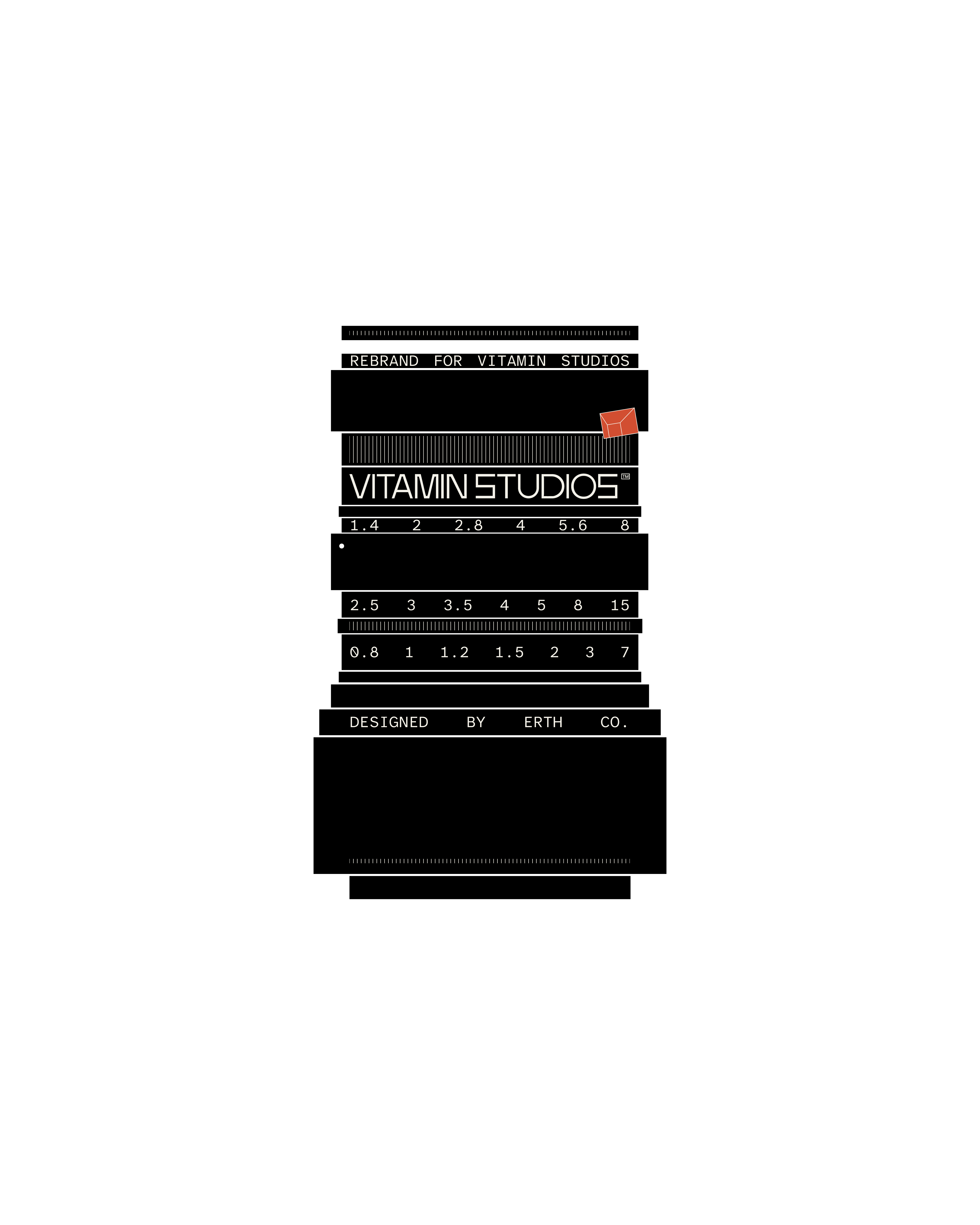
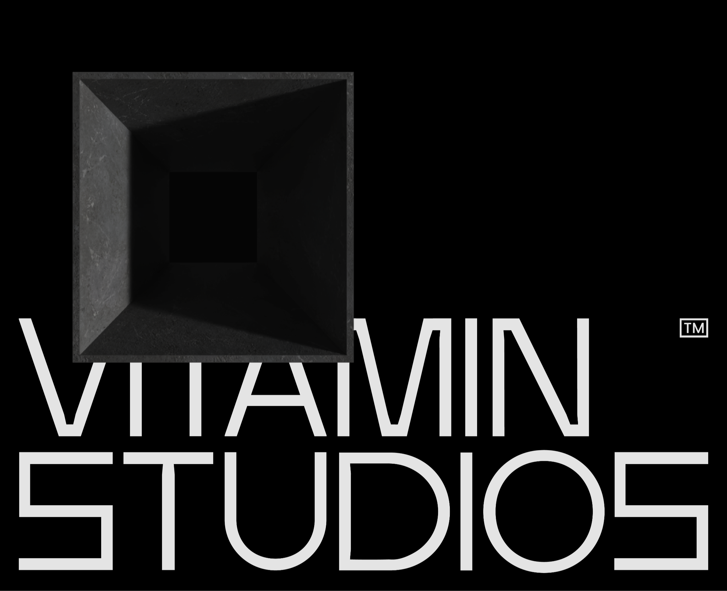
Vitamin Studi
2025
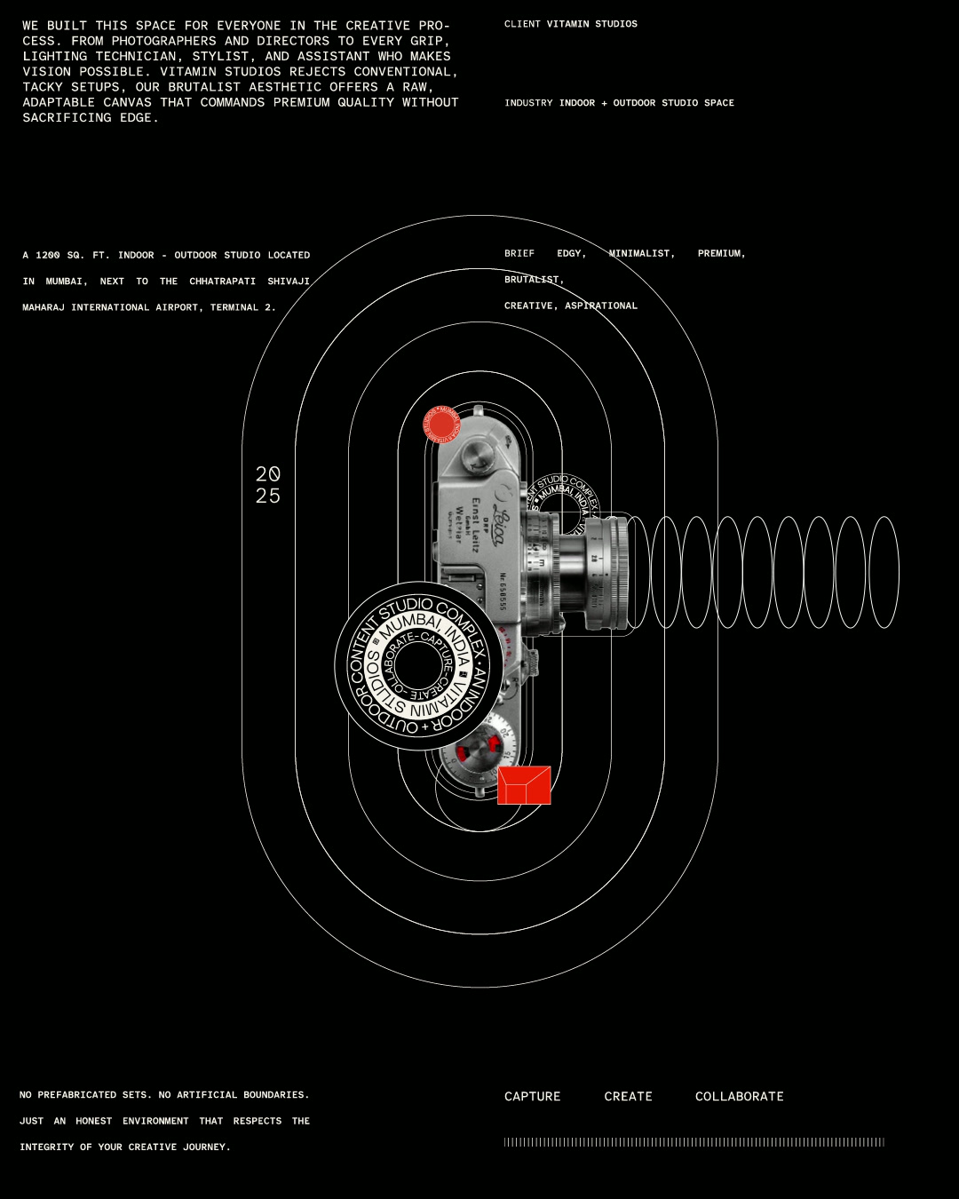
Mumbai
Rebranding, Icon Kit, Devanagri Typography, Brochure Design. Canva Templates and Indoor Signages
Erth Co, a graphic design studio in India, worked with Arjun Doshi to develop a comprehensive brand identity refresh and visual system for his Mumbai-based photography studio, Vitamin Studios.
Brand Identity Design & Visual System for Vitamin Studios
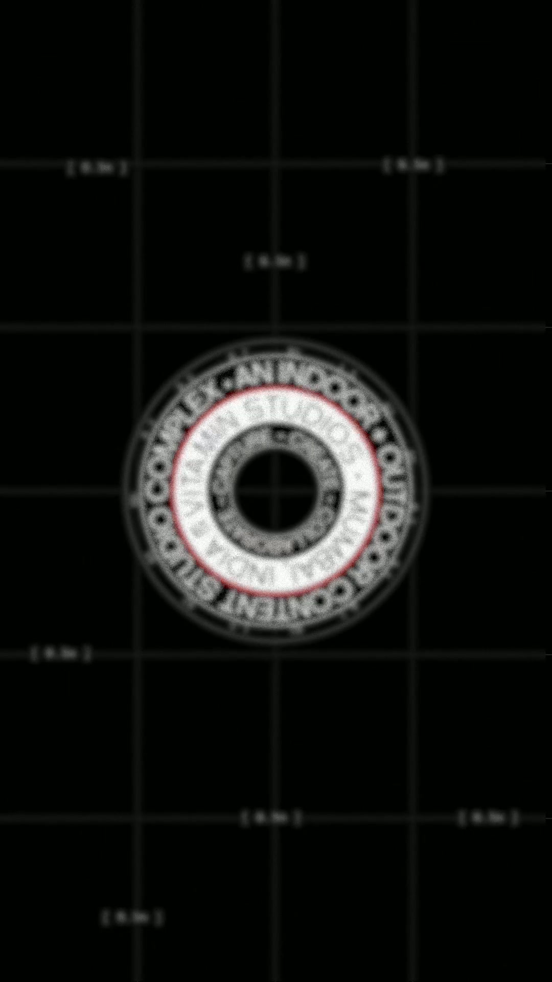
Vitamin Studios approached us for a comprehensive brand refresh and visual identity redesign rooted in what already existed. The studio had an established line-based logo mark, one that hinted at architectural space, a room, a frame, a light box. Rather than replacing it entirely, we conducted a strategic brand audit, studied its underlying structure, and leaned into its existing logic. That single graphic element became the foundation for the entire brand identity system.
From the outset, our creative strategy focused on clarity and flexibility. The goal wasn't just a recognisable brand mark, but a complete design system that could stretch, adapt, and scale across multiple touchpoints while remaining unmistakably Vitamin.
Dynamic Logo Design & Brand Flexibility
The logo was reimagined as a dynamic, modular brand mark. Any iteration, proportion, or framing becomes part of the visual identity. Tilted, cropped, overlapped, enlarged, or broken apart, these variations don't dilute brand recognition. They strengthen it. The mark behaves less like a fixed, static logo and more like a flexible visual language the studio has claimed as its own.
This adaptive logo system ensures consistency without rigidity, allowing the brand to remain fresh and responsive across digital platforms, print materials, and physical applications. Vitamin can overlap the mark onto any creative output without worrying about perfect alignment or hiding background elements — the system is built to be forgiving by design.
Visual Identity System & Brand Guidelines
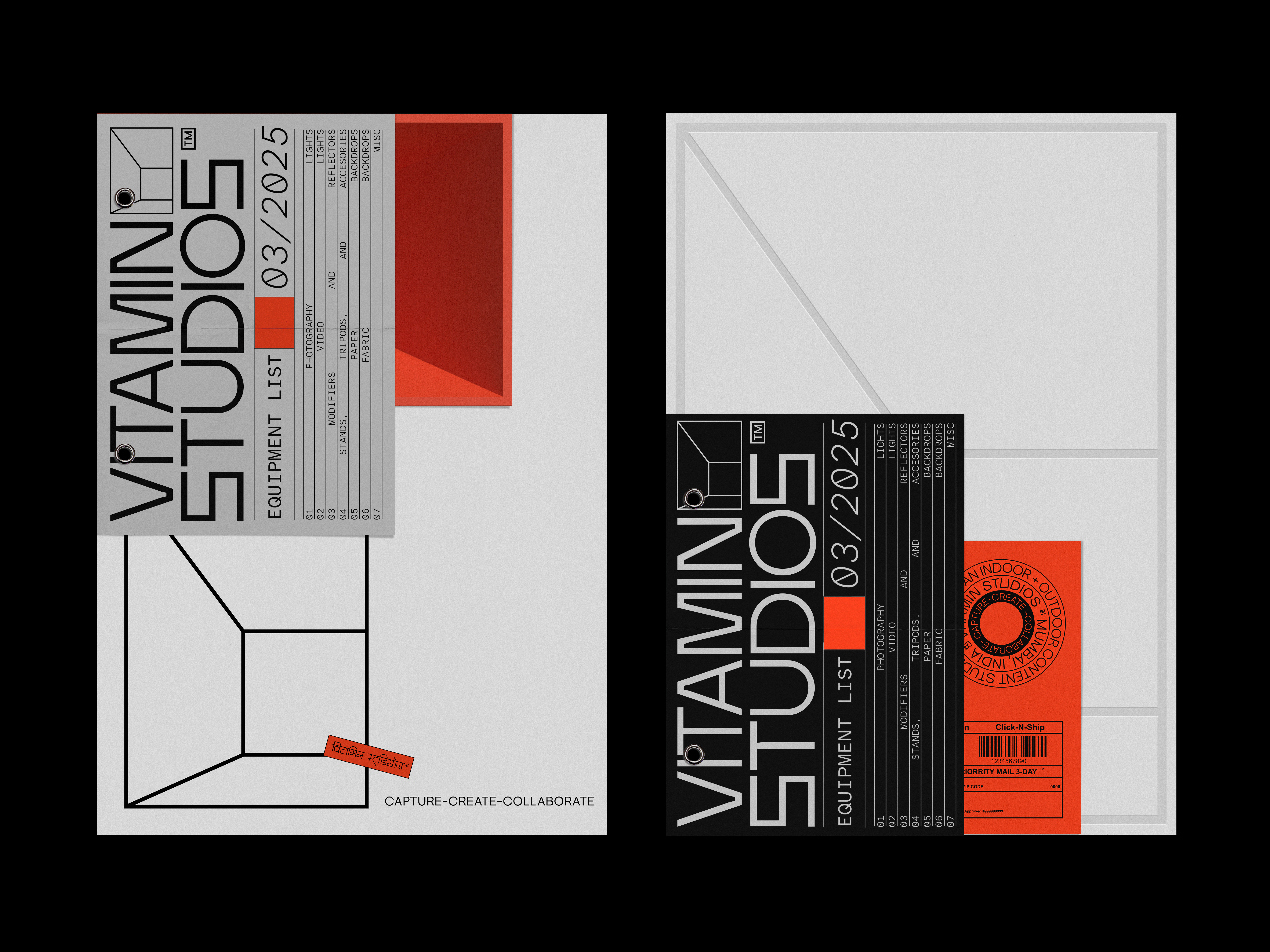
That core thinking shaped the wider brand architecture. We expanded the foundational line into a comprehensive visual language system built on geometry, optics, and measured space. Lines and circles form the structural basis of layouts, compositional frames, and graphic elements that can be assembled freely while still following clear, strategic design principles.
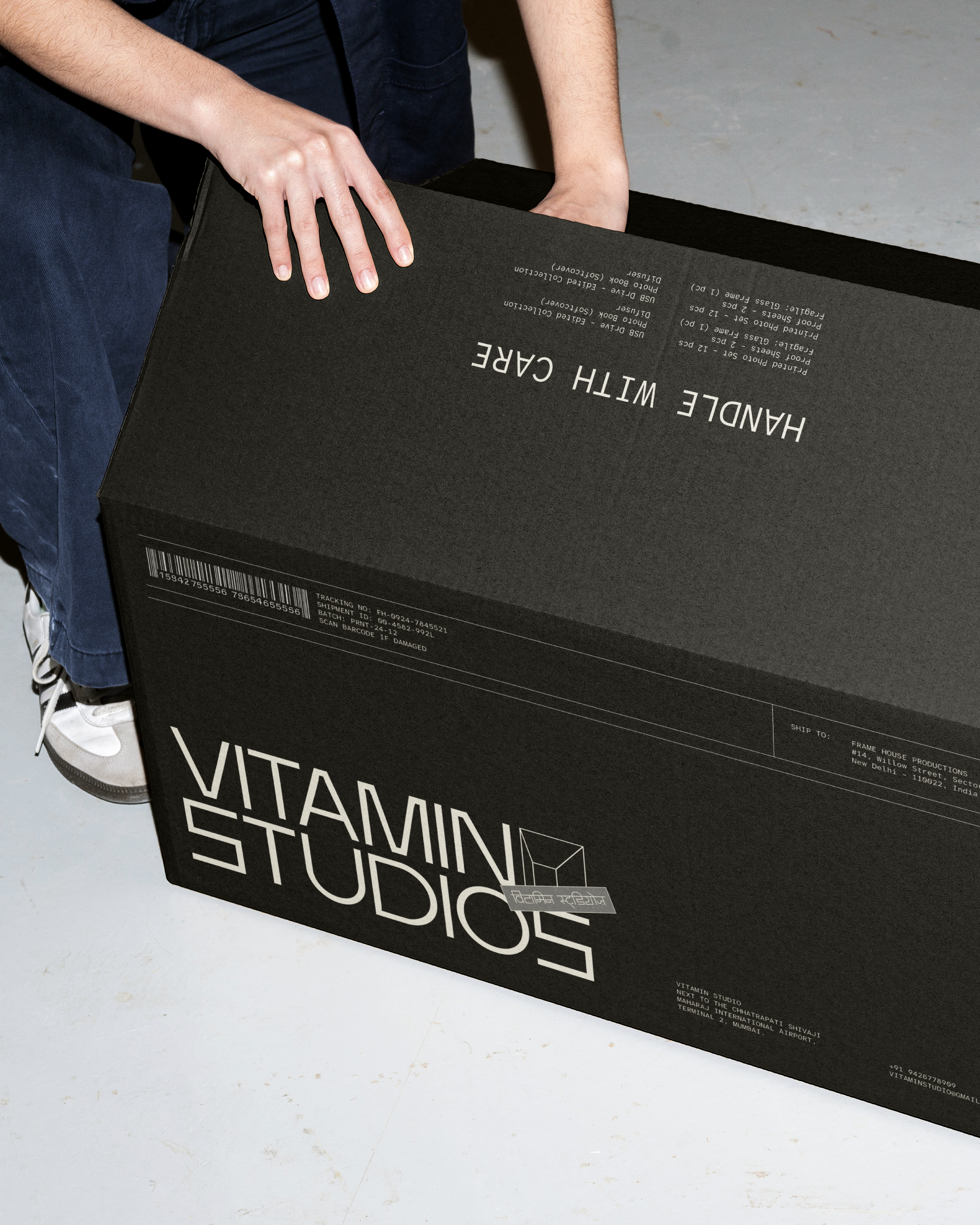
The system is intentionally accessible and forgiving in application. Vitamin can integrate the brand mark onto any creative output, print collateral, environmental signage, product packaging, branded apparel, merchandising, or in-studio materials, without requiring perfect technical alignment or precious execution. As long as the underlying brand logic is respected, the identity maintains its integrity and recognition.
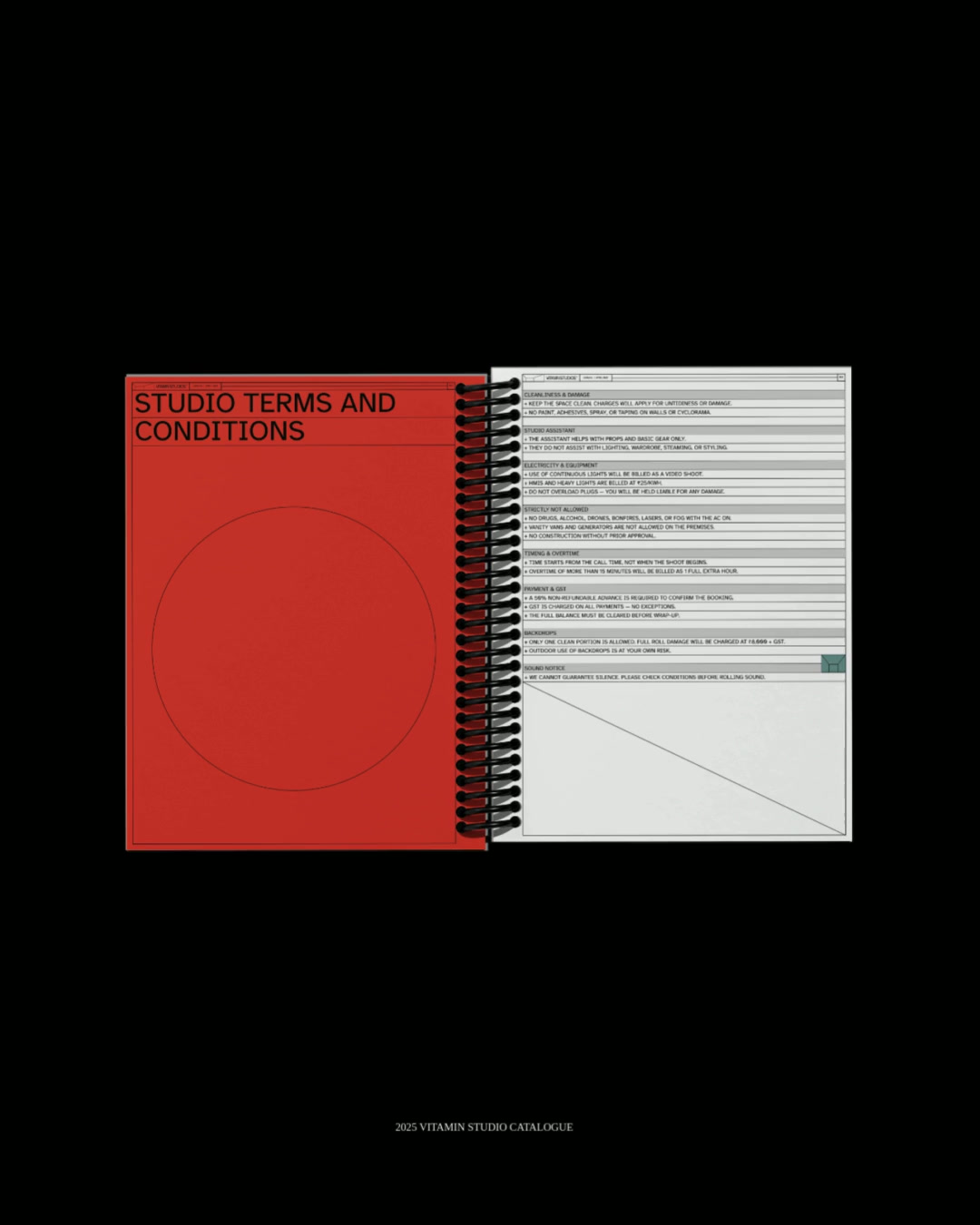
The visual language extends seamlessly across both digital and physical touchpoints: brochure design, price sheet decks, signage systems, and apparel graphics all follow the same geometric foundation while allowing room for creative interpretation.
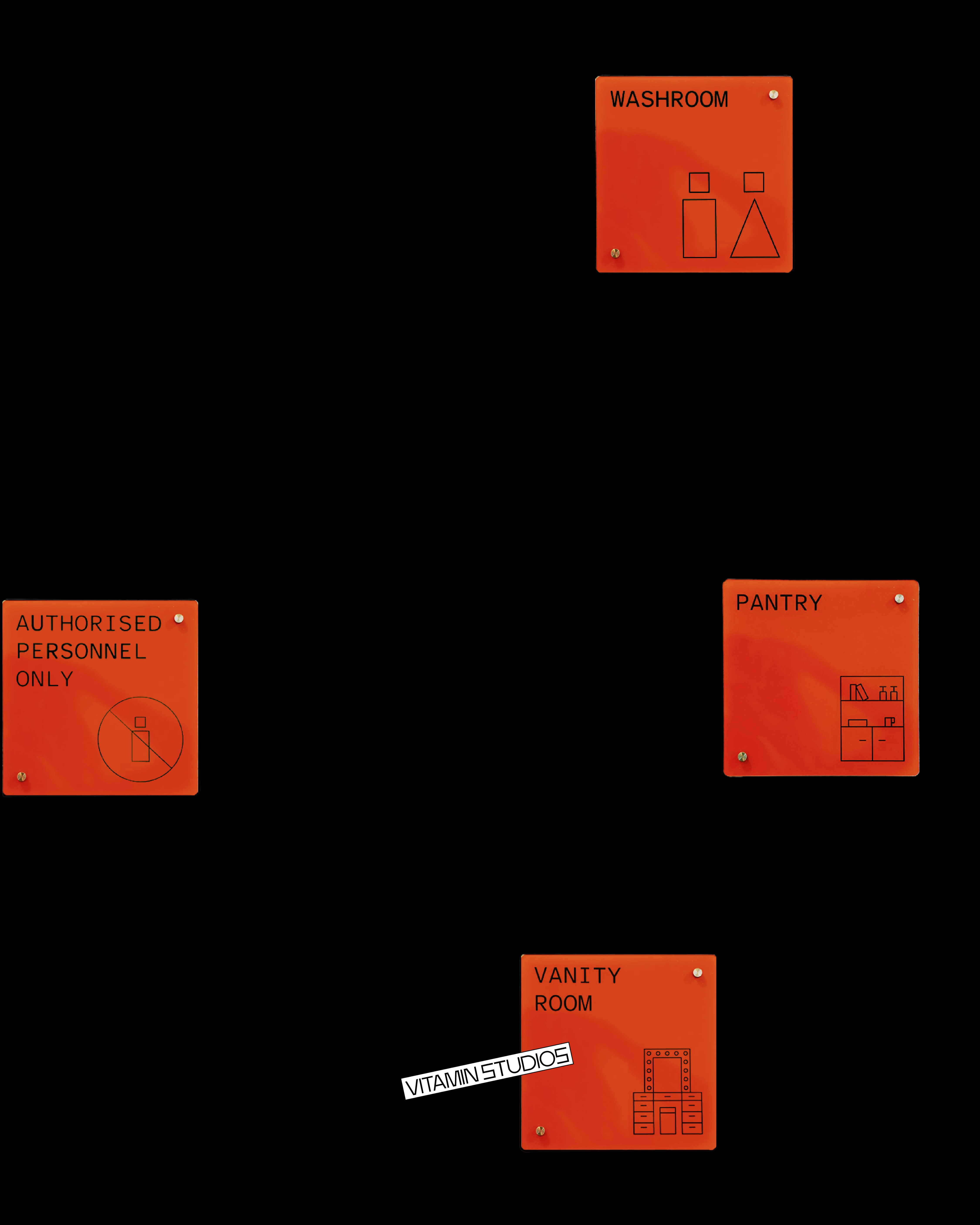
Icon Design & Brand Touchpoints
Custom iconography was developed from the same geometric foundation, reinforcing visual continuity across functional brand touchpoints. The signature line element moves throughout the system as a guiding principle, creating visual rhythm and brand coherence across both physical spaces and printed formats.
Each icon maintains the technical, equipment-led aesthetic of the broader identity, ensuring that every element, from wayfinding signage to digital interfaces, feels unmistakably part of the Vitamin world.
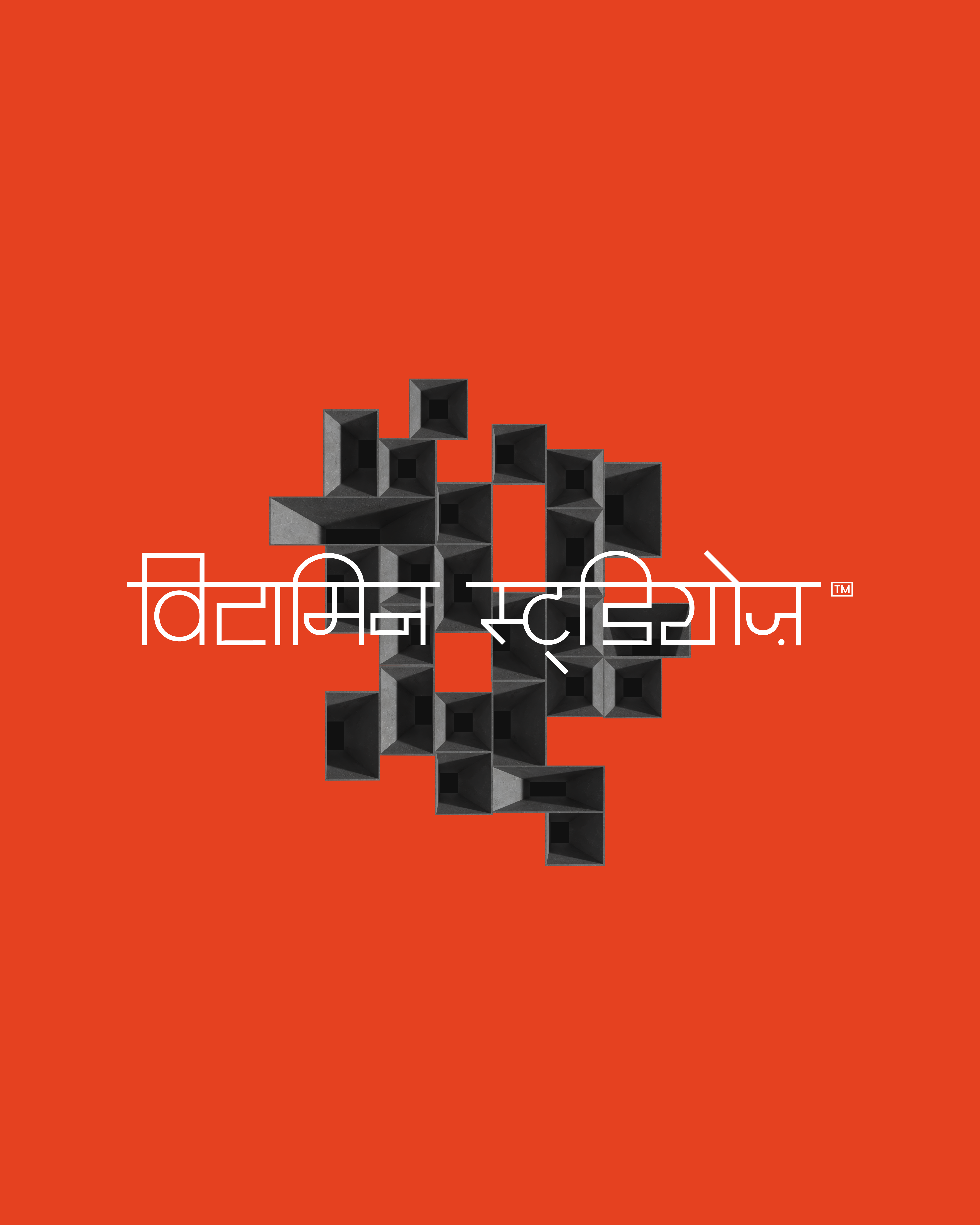
Typography & Multilingual Branding
Custom typography was developed specifically to inhabit this brand world — technical in character, equipment-led in aesthetic sensibility. A bespoke Devanagari typeface counterpart was created alongside the Latin character set, ensuring typographic consistency and cultural authenticity across multiple languages without fragmenting the overall brand identity or visual cohesion.
The dual-script approach wasn't an afterthought but a core consideration from the beginning, allowing Vitamin Studios to communicate seamlessly with diverse audiences while maintaining a unified visual voice.
Brand Strategy & Design Direction
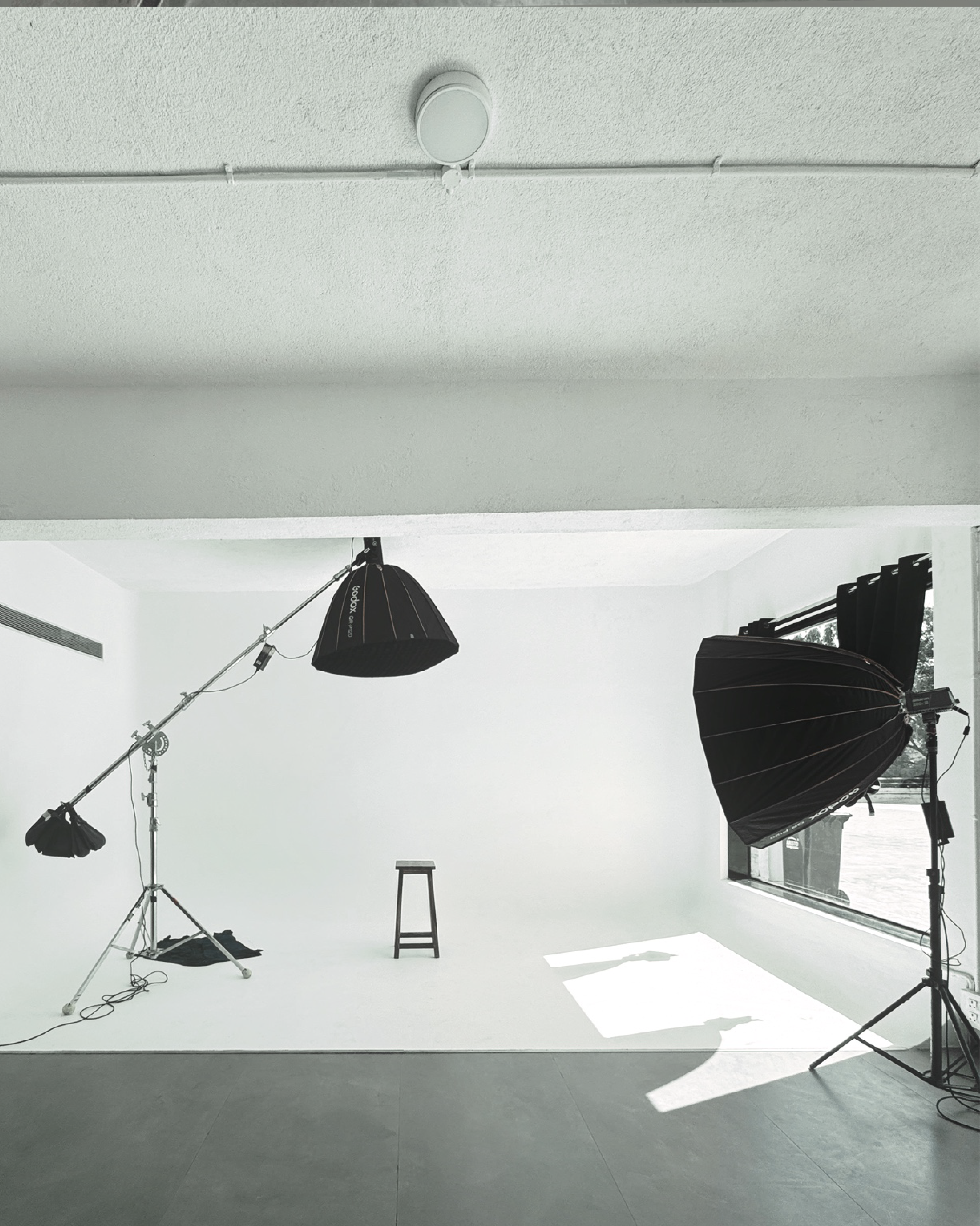
The overall creative direction is restrained and direct. Brutalist in tone, functional by strategic intent. Nothing ornamental or decorative for its own sake. Everything considered, purposeful, and rooted in brand strategy.
Most studio spaces don't brand themselves comprehensively. Vitamin Studios saw that gap and wanted to stand out, not through decoration, but through clarity, precision, and an understanding of how creative professionals actually work. The result is a brand system that behaves like a tool, not an ornament.
The Result
This comprehensive brand refresh delivers Vitamin Studios a clearer, more defined visual identity and a more usable, scalable brand ecosystem — one that's instantly recognisable at a glance, flexible and adaptive in practical application, and strategically built to support both the studio's creative output and the people who engage with the brand every day.
Built by creatives, for creatives. A photography and creative studio in Mumbai that now has an identity as sharp and intentional as the work produced within its walls.
Client
Year
Location
Scope of Work
Project Qaafi
2024
Mumbai
Brand Identity and Packaging Design
Mindful Skincare, Rooted in Heritage
Project Qaafi aims to disrupt a skincare market overflowing with unnecessary products. The brand's philosophy, embedded in its name—'just enough' in Urdu—champions effectiveness and minimalism, resonating with modern Indian consumers craving authenticity and simplicity.
The Challenge
In a saturated skincare market dominated by excess and complexity, Qaafi sought to create a distinct identity that would:
-
Cut through the visual noise of conventional beauty packaging
-
Reflect its commitment to indigenous ingredients and formulations
-
Balance contemporary design with cultural resonance
-
Communicate efficacy and mindful consumption
Our Approach
The design strategy focused on creating a brand identity that feels both familiar and forward-thinking. We developed:
Typography & Identity
-
A bold, sans-serif wordmark that breaks away from traditional feminine-coded skincare aesthetics
-
Custom 'f' character inspired by the Devanagari बड़ी ई की मात्रा, grounding the brand in its Indian heritage
-
Secondary brand assets including a distinctive 'tara' (star) and 'tula' (scales) motif
Visual Language
-
Strategic fusion of nostalgic Indian elements: firecracker packaging stars, regional calendar typography, and matchbox chevron patterns
-
Halftone artwork reminiscent of vintage Bollywood visuals
-
Bold geometric forms that command attention while maintaining sophistication
Packaging Innovation
-
100% recycled concrete-textured paper with embossed details
-
Strategic window cutouts revealing product information
-
Interactive inserts featuring life-sized portion guides
-
Straightforward communication of product benefits
-
Integration of familiar Indian visual cues
The Outcome
The resulting brand identity successfully:
-
Establishes Qaafi as a distinctive voice in the Indian skincare market
-
Creates an immediate emotional connection through strategic use of nostalgic elements
-
Delivers practical innovation through intuitive user experience design
-
Maintains a premium positioning while championing sustainability
-
Effectively communicates the brand's philosophy of mindful consumption
Project Qaafi represents a new direction in Indian skincare—where heritage meets modernity, and where design serves both form and function. The brand stands as a testament to the power of thoughtful design in creating meaningful consumer connections.